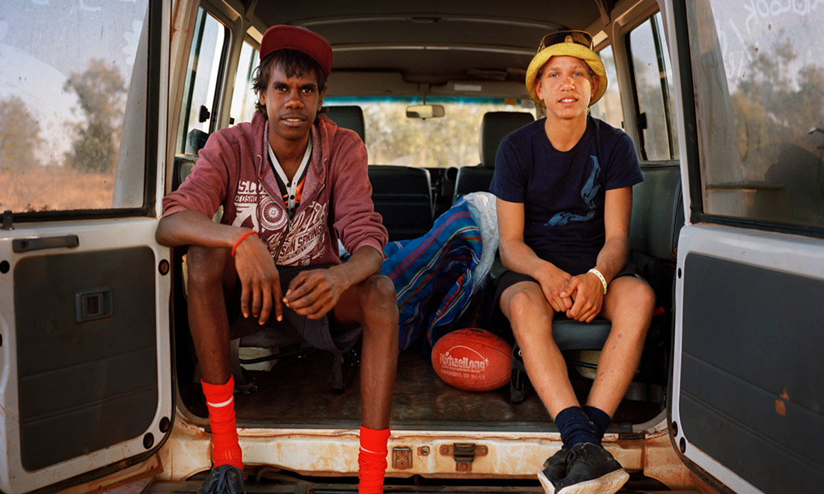
Project Overview
The Red Cross refreshed its brand and needed a digital design that brings it to life. The resulting digital brand design, GEL, and website update were delivered over 18 months.
This comprehensive digital product design project was executed end-to-end, with the development handled on the client side. The project remains in progress, with a projected launch in August.
Impact & outcomes
01
Streamlined Content Management
A structured CMS and GEL empower internal teams to create high-quality content.
02
Enhanced User Experience
Improved accessibility and clarity for users in crisis and donors alike.
03
Improved Engagement
Interactive elements and storytelling components foster deeper audience connection.
04
Scalability & Future-Proofing
The modular design system supports ongoing growth and adaptability.
05
Stronger Brand Consistency
Unified digital branding strengthens trust and recognition.
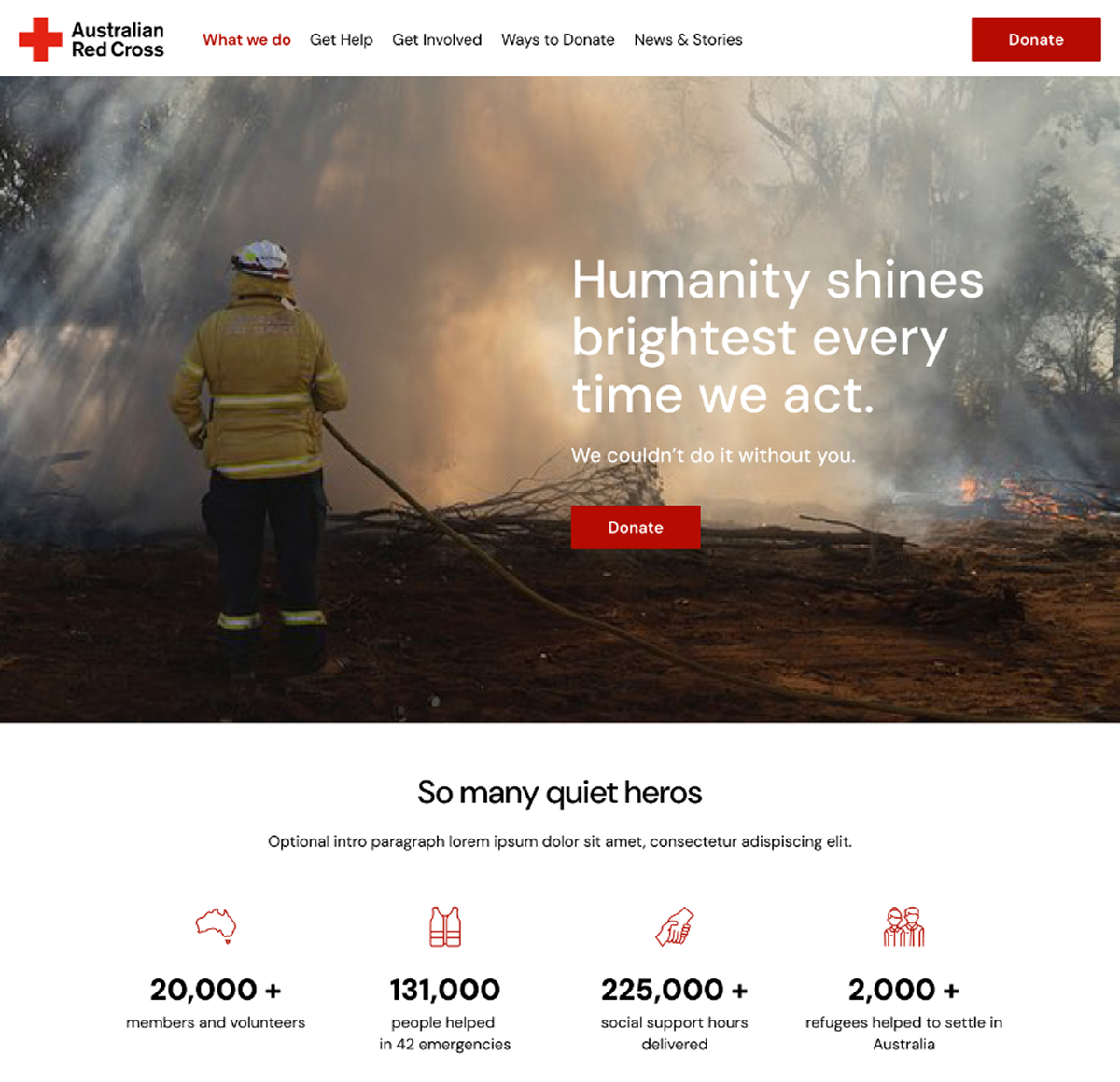
Brand Drivers that became our guardrails for the digital direction
- 2023 ARC Brand Traits that answer to photojournalism’s guiding principles
- Emotional: Empathetic, Authentic, Warm
- Rational: Confident, Credible, Neutral
- Reaction: Make it Easy for People to Act, Walk the Talk
- Respecting the diverse needs of varied user groups. Addressing the unique needs of refugees in crisis, as well as philanthropists seeking to support the ARC’s mission.
- A consistent and flexible system. Ensuring trust in the brand while accommodating the complexity of the organisation’s operations.
Designing for diverse audiences
Our research has identified two primary user groups, each with distinct needs:
- People seeking help: Often arriving on the site in distress, looking for immediate assistance following disasters or upon arrival in Australia.
- People wishing to give help: Looking for validation and guidance on how best to support those in need.
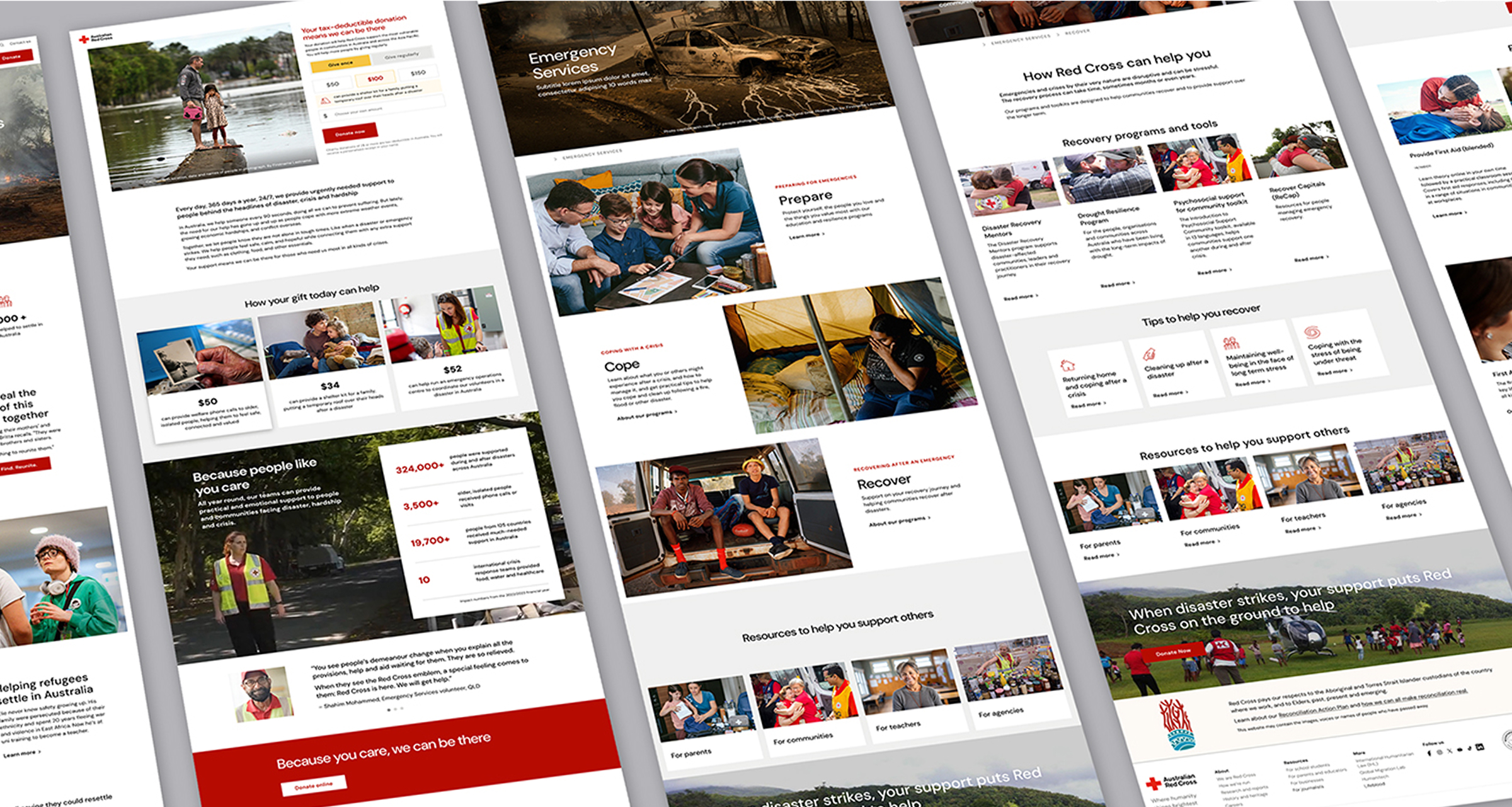
To address these distinct needs, we developed a set of key pages that serve as a guide for content creators, ensuring a seamless and empathetic user experience.
Bringing the new brand to life
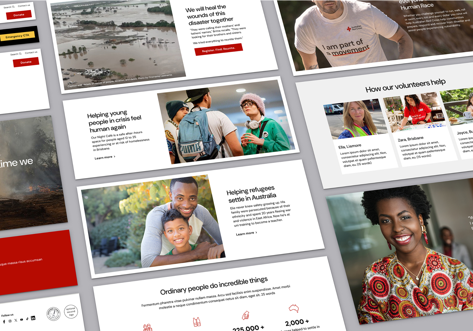
Beyond strategy, our focus was on crafting a modern, vibrant digital brand. This involved:
- Integrating animations and dynamic elements such as parallax and horizontal scrolling.
- Expanding video content capabilities to enhance engagement and storytelling.
A New Component Suite
This large-scale website update involved:
- Creating 36 new and updated UI components and collaborating with an external development team to implement them in Optimizely.
- Designing 70+ key pages and user journeys with a research-driven approach, including a new donations journey using expertise created in a distinct research project.
- Introducing a ‘component spec sheet’ as a design reference to streamline communication between design and development teams.
- Working with digital developers LEVO to implement and roll out the new design across all components
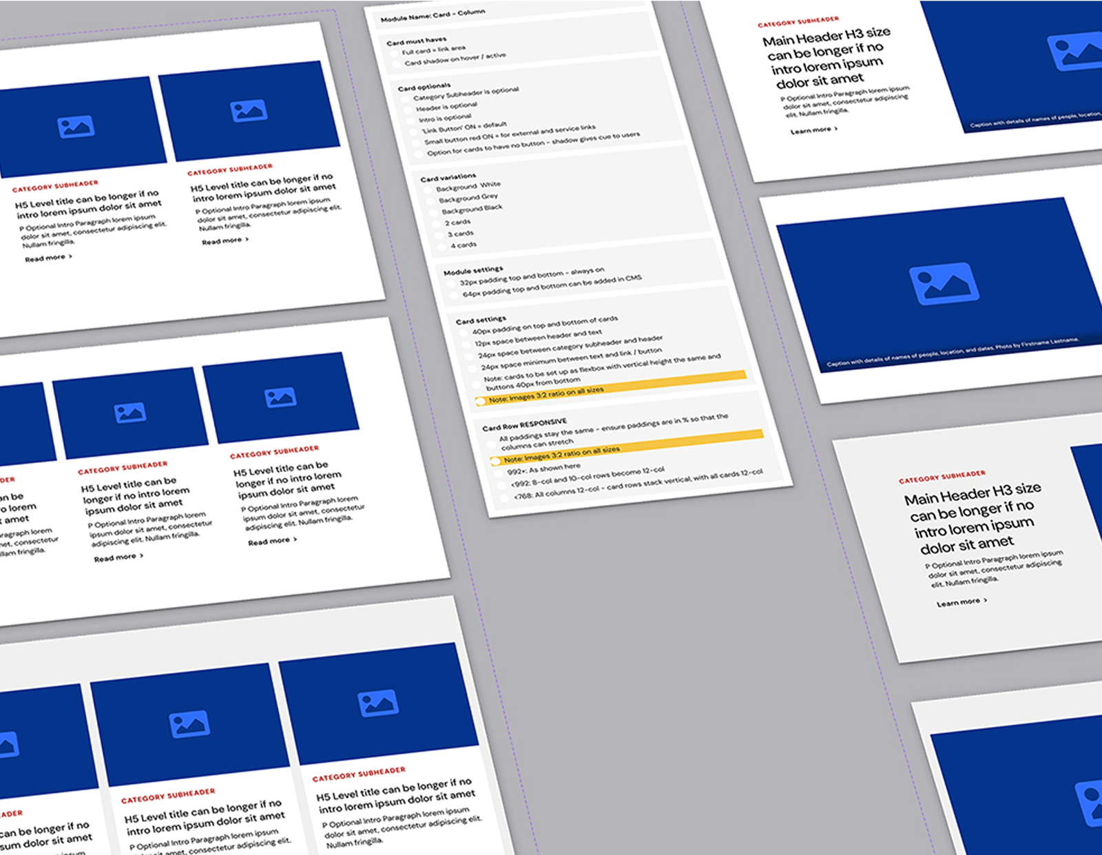
Design system in Action
The Design System is available as both a Figma library file and a GEL website, ensuring accessibility for all Australian Red Cross staff. This resource:
- Educates teams on design principles and user experience best practices.
- Establishes a common language and detailed documentation for every component.
Encourages seamless collaboration between teams, improving content creation and consistency.