Category: uplift

  • Teacher’s Health Fund

    Teacher’s Health Fund

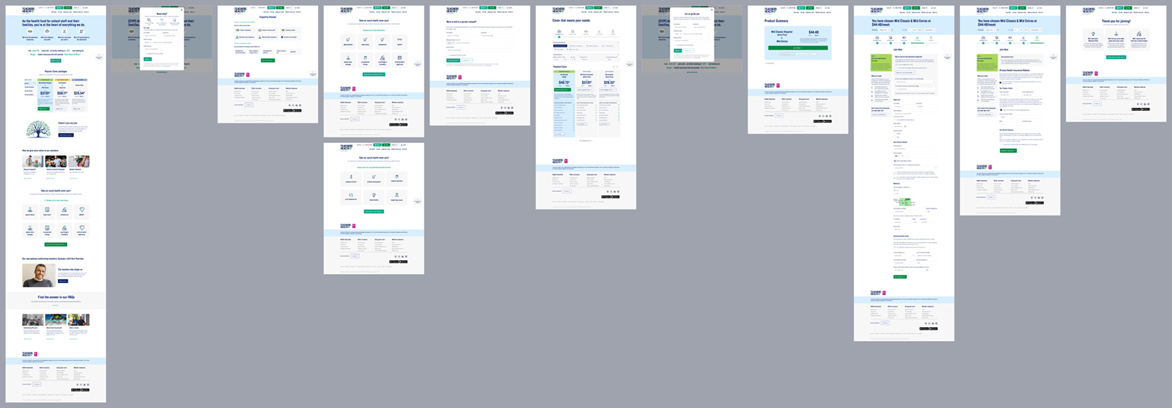
    This member-based health fund, eligible to parts of the community only, is operating in a rapidly evolving sector with heightened competition and increased expectations of digital experiences. A lack of investment in experience has become a risk to competitiveness to the fund, so Deepend was engaged to strategically bring the website to digital parity using a data-driven and user-centric approach. We focused on the prospect journey as proof of concept, using a two-phased approach that is currently being rolled out.

    We collaborated with the fund’s team to create an optimised journey that aligns with industry best practices and user expectations, introducting rapid experiments and improvement frameworks to ensure measurable acquisition uplift.

    Phase 1: demonstrating uplift

    5% uplift

    ‘Quote’ conversions

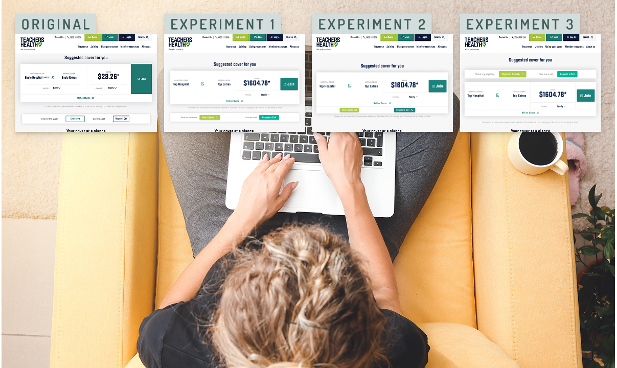
    Quick and agile experimentation resulted in refined UX/UI that maximises conversion in short term, prior to development effort.

    10% uplift

    ‘Join’ completions

    Improving clarity, setting expectations and refining experience created uplift in acquisition while still using the existing form.

    >> uplift

    Establishing a roadmap that drives long-term agility and iterative acquisition improvement sets the groundwork for digital parity.

    Phase 2: getting to digital parity

    01

    Filling gaps in experience

    Created pathways towards bringing experience up to best practice, ‘chunking up’ journey parts to enable staged delivery.

    02

    Leveraging off stronger data

    Created pathways for continuous improvement via GA4 tracking and agile testing processes for future interventions.

    03

    Driving towards an ideal future

    Leveraging user insights to ensure development effort is put towards the right improvement and planning for creating the ideal future.

    Strategic, data-driven co-creation

    A six-week discovery sprint using a collaborative model with a cross-organisational team assessed the effectiveness of the fund’s existing digital prospect journey.

    Our approach combined qualitative and quantitative insights, competitor benchmarking, and real-time experimentation to inform a backlog of high-impact initiatives.
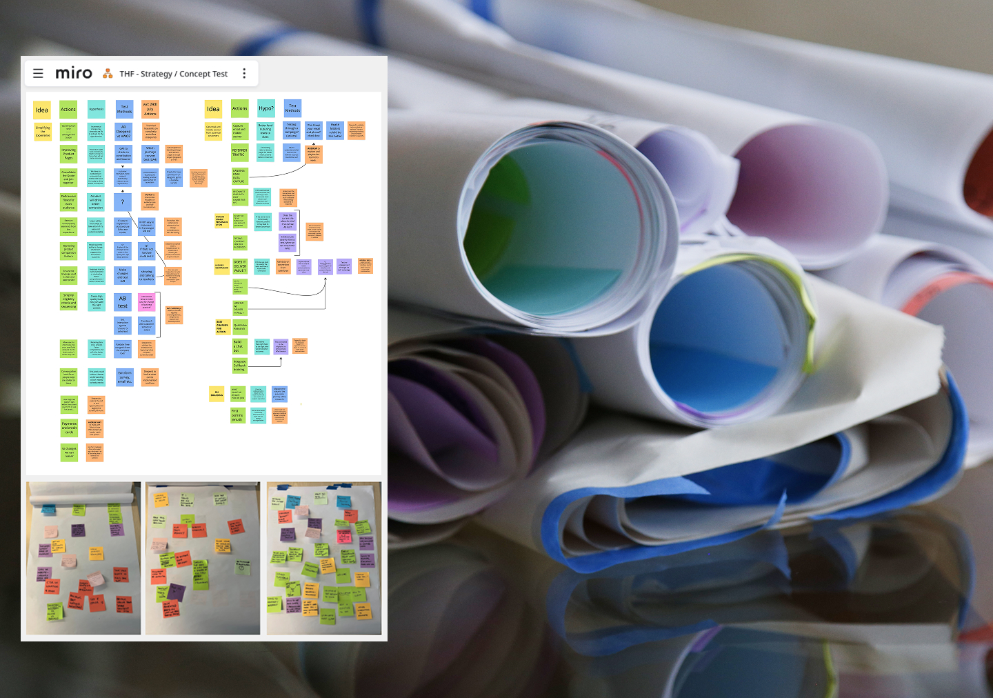
    example of stakeholder alignment and strategy work

    Stakeholder alignment workshops

    A six-week discovery sprint using a collaborative model with a cross-organisational team assessed the effectiveness of the fund’s existing digital prospect journey. Our approach combined qualitative and quantitative insights, competitor benchmarking, and real-time experimentation to inform a backlog of high-impact initiatives.

    User research and testing

    Identifying key experience gaps and validating potential interventions.
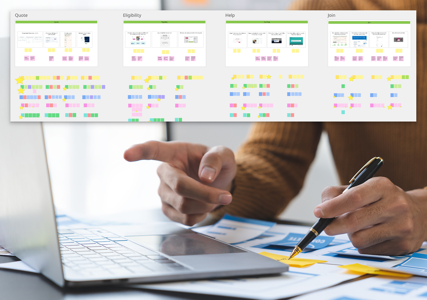
    Example of user research work
    Example of quick UX uplift experiments

    Hypothesis-driven experimentation

    Iteratively improving conversation paths and optimising core digital touchpoints, delivered in agile sprints.

    Filling experience gaps

    Leveraging off insights and hypotheses created in the strategic phase, we moved towards creating an ideal future, designing small-scope itemised parts of the future journey and refining them with experimentation.
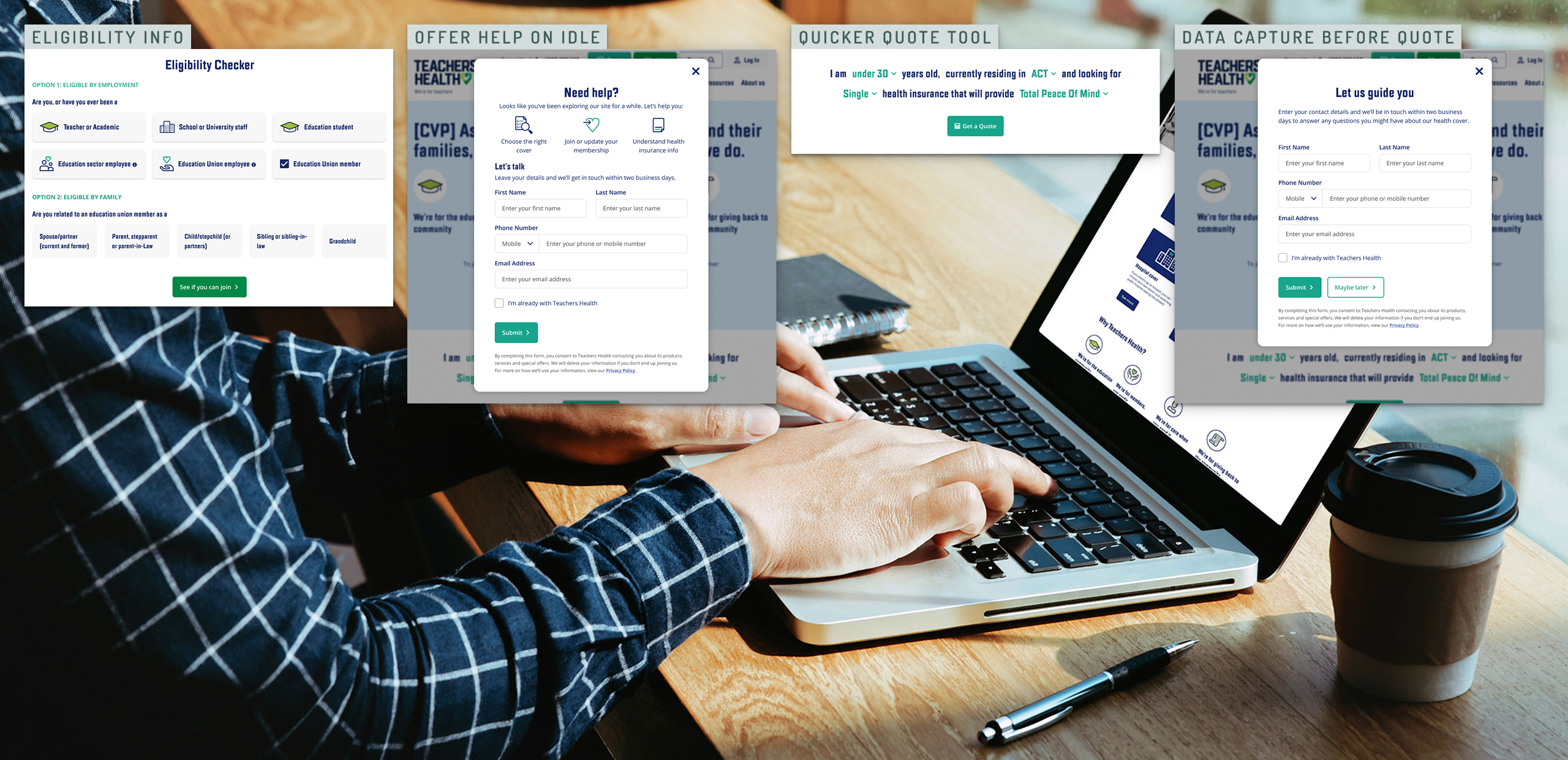
    Quick experiments with parts of the ideal future journey for phasing out project scope

    Driving towards an ideal future

    During the first phase, we had increasingly pointed experiments towards an ideal future. In phase 2, I designed a prototype to take the ideal future we all believed in to user testing. Because the continued experimentation established some guardrails already, we were able to scope a lean test with parts of the overall acquisition journey already proven and under development.
  • Sound Surge

    A Collaborative Update

    Sound Storm was originally developed by Deepend for National Acoustics Laboratory before I joined the company. I have been leading the experience design on various updates and continuous improvement projects.

    This large update, called Sound Surge, is currently in development and takes Sound Storm to a new market in the US.

    The original award winning project is described well in this case study by Deepend

    Sound Storm story design hero Suno the lion
    Sound Storm digital product map

    Roadmapping Digital Product Options

    The complexity of options available to us in creating a new digital product out of the legacy Sound Storm app required us to communicate possibilities with all stakeholders. So, Deepend founder Matt G and myself collaborated in creating an overview in an interactive visual map on Miro.

    A screenshot from Figma showing a legacy digital product being updated

    Product Design Approach

    Because this project started with a legacy design, our major design updated is a mix of fact-finding, wireframes for new functionality and updated UI elements to meet modern criteria for resolution and accessibility and to satisfy user needs we learned about over time.

    A Fact-Finding Mission

    A major update of a legacy product, by its nature, often results in going to the vault and finding documentation – what software is used changes over time.

    For this design, the original was delivered in a layered photoshop file, so my own legacy skills came in handy (I first learned Photoshop Version 1 as a teen helping out in my dad’s creative agency)

    Incorporating User Knowledge

    Drawing on the critical user knowledge from team members Kath O’Malley (product owner) and Isaac Nault (product manager), we found the best and most viable UI update together.

    As experience lead, I made sure to incorporate what the team learned from real live users over the years, so we could create an update that is even easier to use and understand than the original.

    As the new app is about to go live in schools around the US, I hope it will help even more children understand their teachers in noisy school environments – a cause that has been dear to my heart. Good luck, Suno!

  • Active Super

    Active Super

    Active Super is an ESG super fund that underwent a full rebrand and digital transformation with Deepend. Following this, we developed a continuous improvement model for them and tested widely. Our testing showed strongly that ESG focused customers wanted to have a detail view of where their money was invested.

    So, we suggested developing a data visualisation tool that answered to this customer need.

    Developing a data visualisation tool with a brief of full transparency and the underlying data model unclear at the start of the project was a tough ask. This is the result.

    Research

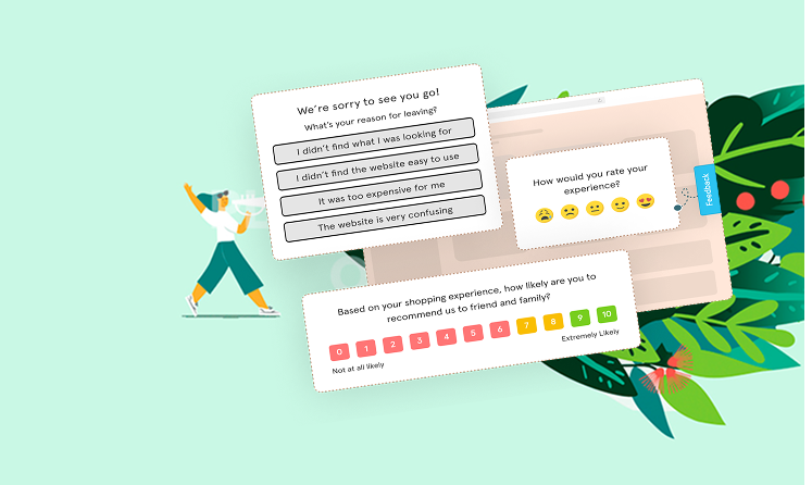
    Website users surveyed

    Exploring what data they wanted to see from their super fund

    2

    Finding two desirable data visualisation tools to develop

    Data workshops

    Close collaboration with the client data team

    Product Design

    Design directions

    Initial work on how to present the data as an interactive tool went in a variety of different directions

    Final outcomes

    The two final interactive tools slice and show the investment data from diffferent angles

    Creating surveys for Active Super

    Website surveys

    We ran a series of quick website surveys asking users what information about the investments the fund makes on their behalf were most important to them.

    The answer: the countries and industries invested in.

    Data model

    We collaborated with the client to come up with a data model that allowed us to drill into the investment information from the angles we needed, a new sorting system to what they used internally (I guess unsurprisingly)

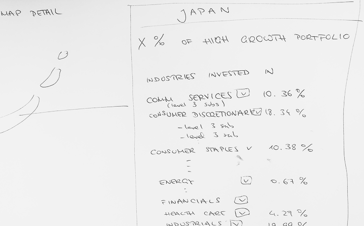
    Sorting data correctly to drive visualisation design for Active Super
    Planning for the world map interactive visualisation for Active Super

    Visualising the data

    The investment portfolios were presented in detail using a moving zoom function.

    First round wires for drilling into data by country

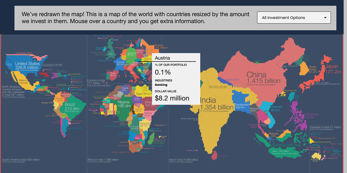
    Our early designs focused on the interaction but contained less depth of data – this design uses a world map with resized countries to visualise the size of investments.

    The initial world map design for Active Super

    Final design for data world map

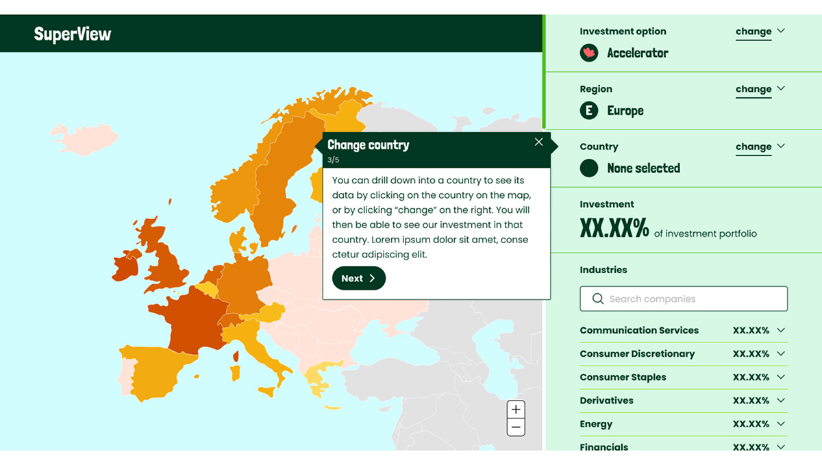
    In the final map design a right hand panel facilitates filtering and searching so that multiple levels of data can be presented in one view.

    The final world map design for Active Super

    Drilling into multiple levels of data using mouse-activated zoom function

    The investment portfolios were presented in detail using a moving zoom function.

    This enabled us to show multiple levels of data right down to individual companies, in one pretty tight interactive design.

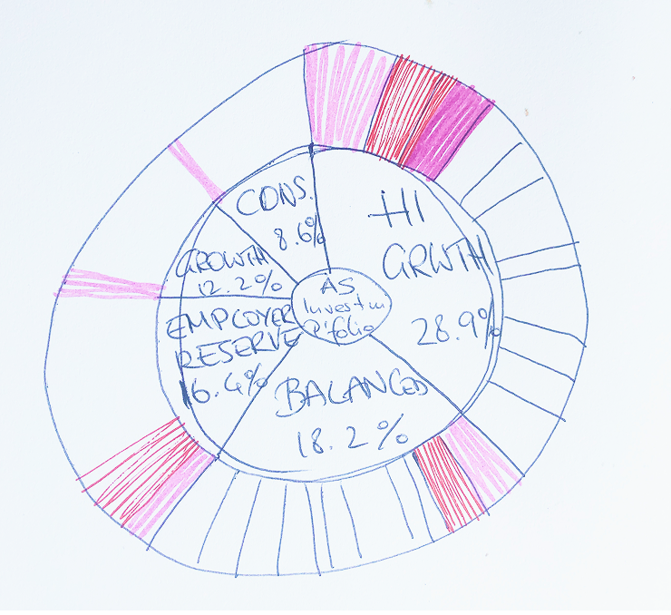
    Sketching a zoom-in visualisation for Active Super

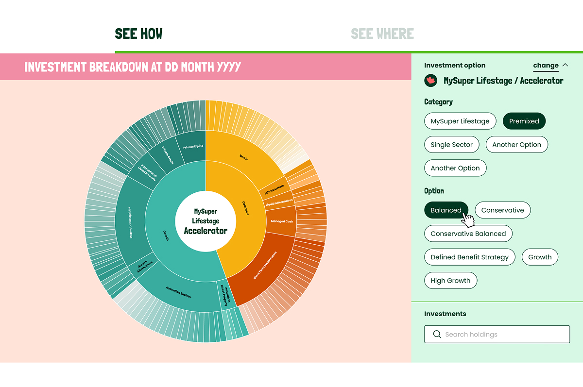
    Final design for ‘sunburst’ zoom visualisation

    The final design allows the user to zoom using their mouse, filter on the panel on the right, or search for any company invested in directly.

    Final design for interactive zoom visualisation for Active Super