Author: admin

  • Active Super

    Active Super

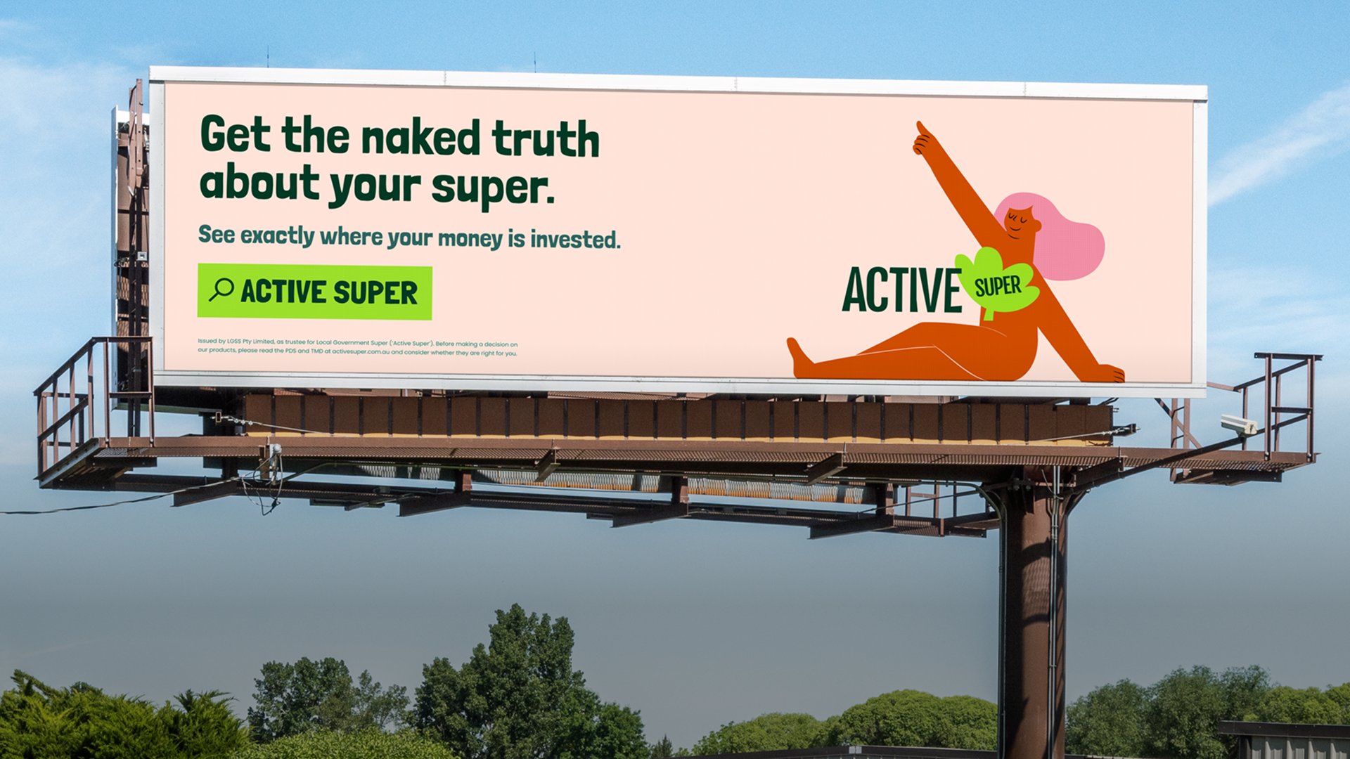
    Active Super is an ESG super fund that underwent a full rebrand and digital transformation with Deepend. Following this, we developed a continuous improvement model for them and tested widely. Our testing showed strongly that ESG focused customers wanted to have a detail view of where their money was invested.

    So, we suggested developing a data visualisation tool that answered to this customer need.

    Developing a data visualisation tool with a brief of full transparency and the underlying data model unclear at the start of the project was a tough ask. This is the result.

    Research

    Website users surveyed

    Exploring what data they wanted to see from their super fund

    2

    Finding two desirable data visualisation tools to develop

    Data workshops

    Close collaboration with the client data team

    Product Design

    Design directions

    Initial work on how to present the data as an interactive tool went in a variety of different directions

    Final outcomes

    The two final interactive tools slice and show the investment data from diffferent angles
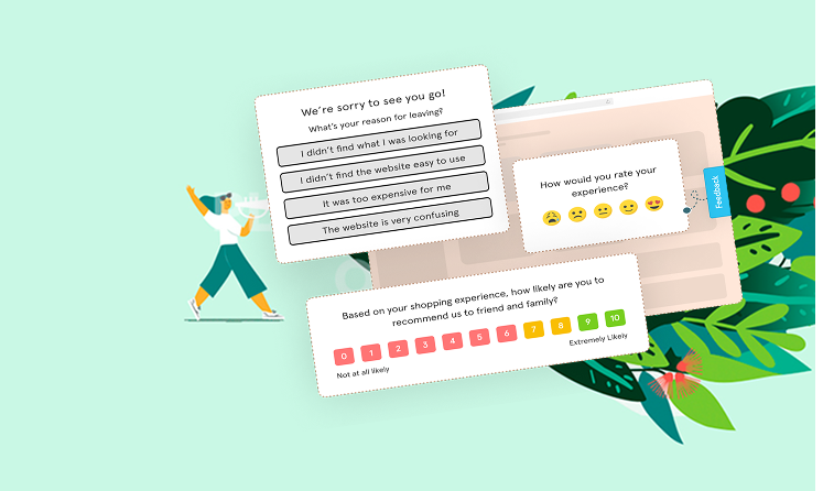
    Creating surveys for Active Super

    Website surveys

    We ran a series of quick website surveys asking users what information about the investments the fund makes on their behalf were most important to them.

    The answer: the countries and industries invested in.

    Data model

    We collaborated with the client to come up with a data model that allowed us to drill into the investment information from the angles we needed, a new sorting system to what they used internally (I guess unsurprisingly)
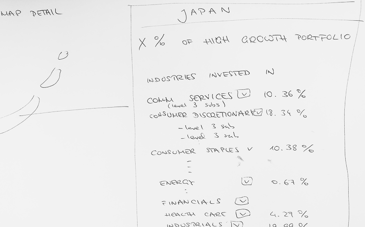
    Sorting data correctly to drive visualisation design for Active Super
    Planning for the world map interactive visualisation for Active Super

    Visualising the data

    The investment portfolios were presented in detail using a moving zoom function.

    First round wires for drilling into data by country

    Our early designs focused on the interaction but contained less depth of data – this design uses a world map with resized countries to visualise the size of investments.
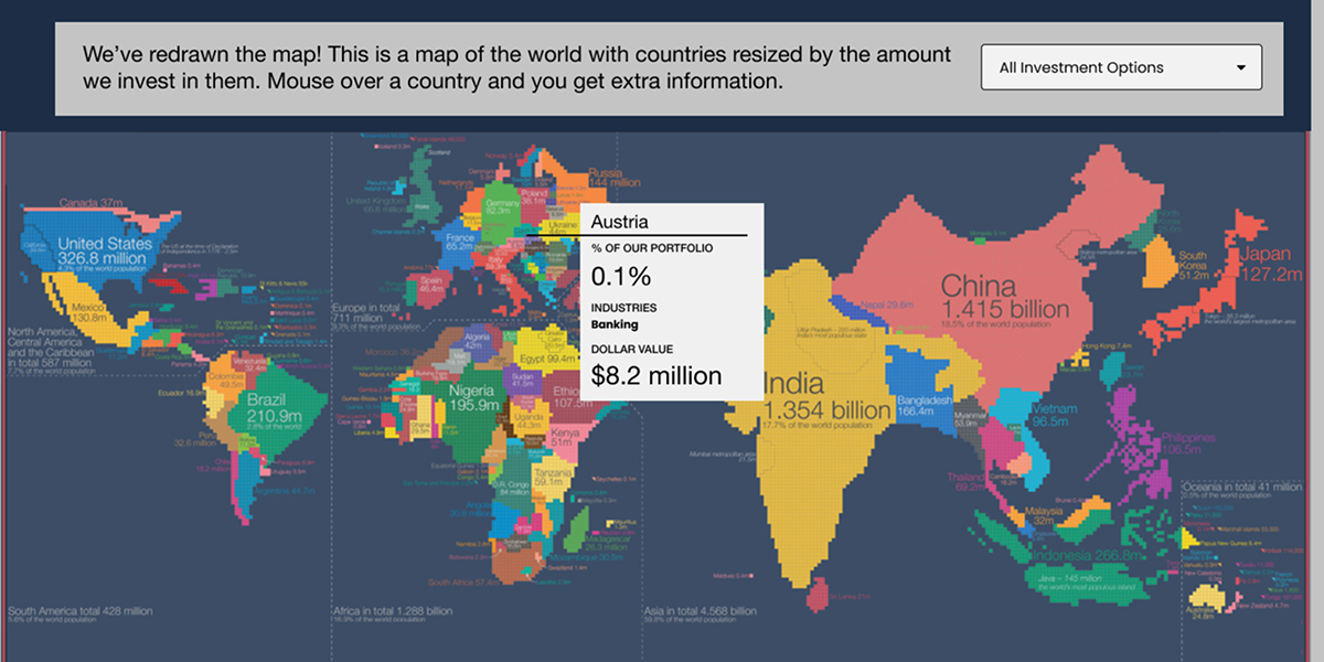
    The initial world map design for Active Super

    Final design for data world map

    In the final map design a right hand panel facilitates filtering and searching so that multiple levels of data can be presented in one view.
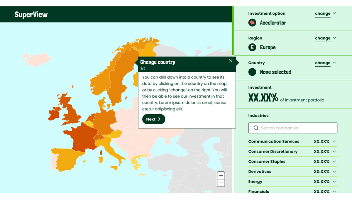
    The final world map design for Active Super

    Drilling into multiple levels of data using mouse-activated zoom function

    The investment portfolios were presented in detail using a moving zoom function.

    This enabled us to show multiple levels of data right down to individual companies, in one pretty tight interactive design.
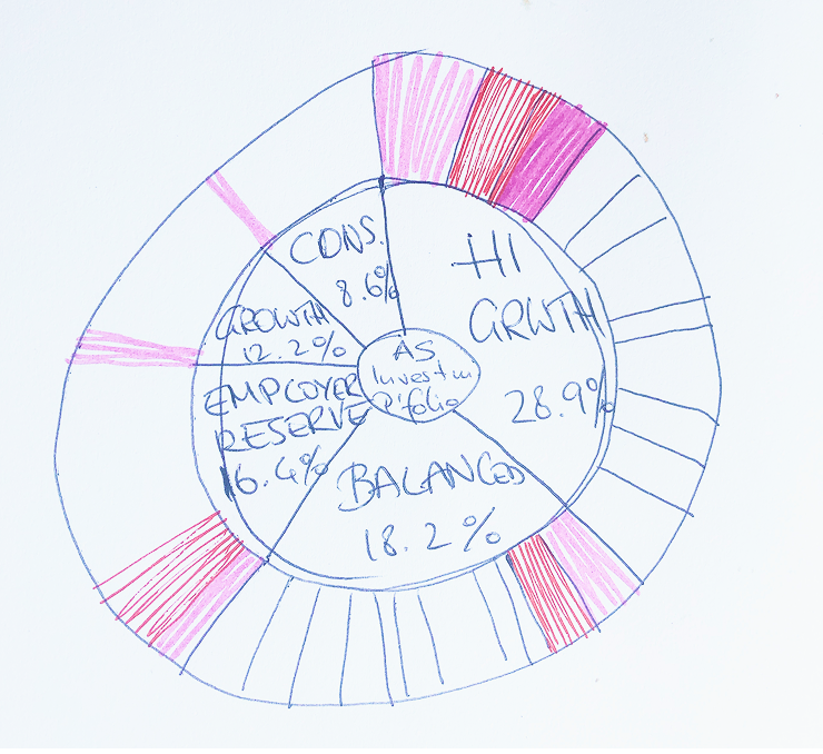
    Sketching a zoom-in visualisation for Active Super

    Final design for ‘sunburst’ zoom visualisation

    The final design allows the user to zoom using their mouse, filter on the panel on the right, or search for any company invested in directly.
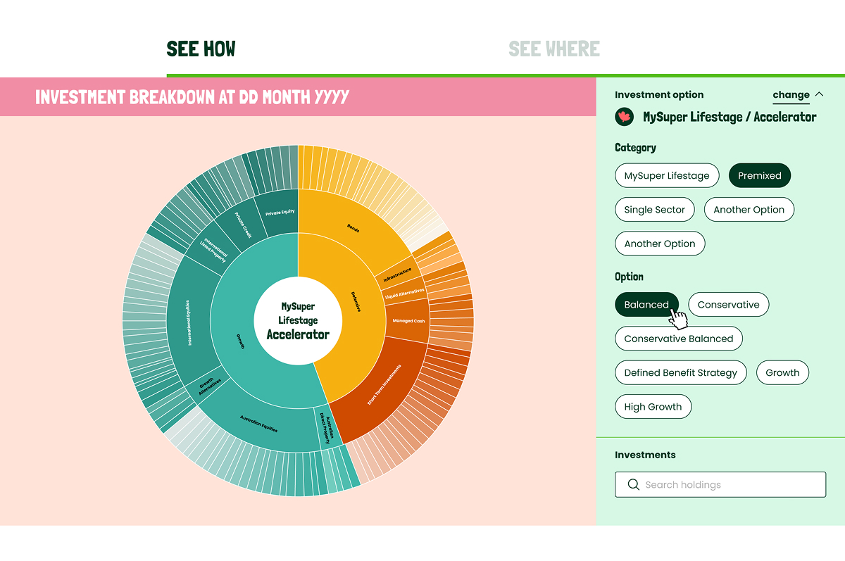

    Final design for interactive zoom visualisation for Active Super
  • CLV Homes for Students

    CLV Homes for Students

    Campus Living Villages (CLV) are global student accommodation specialists creating tailored student communities that suit the unique culture of each campus, University or city they work with. So, they came to us with a brief to develop a refreshed brand that allows them to reflect their incredible diversity while creating a unified experience.

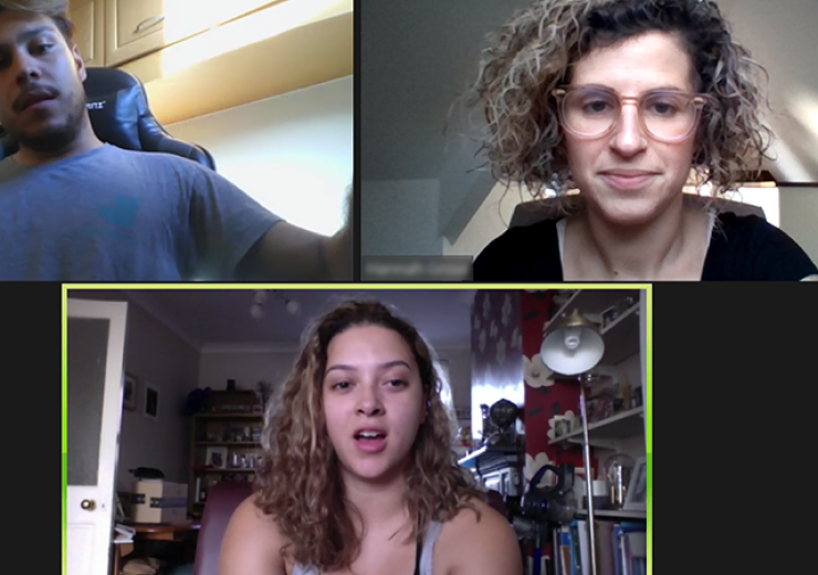
    Screengrabs from user interviews for CLV

    We interviewed 44 students across 4 continents, benchmarked best practice in experience in the category, and involved stakeholders, students and subject matter experts in co-design workshops.

    Following the research, we created personas and user journeys for a variety of user groups, experience guardrails, and more.

    Journey mapping example for CLV
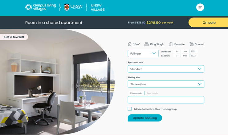
    Example Room Booking design for CLV

    I undertook an extensive UX audit of the room booking processes in each region.

    In a collaborative process with the client, I updated the business logic for displaying and booking rooms, delivering on a best-in-class integrated user experience.

    This project required us to deliver all content and full UX wires for every page.
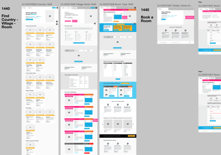
    I first created a new IA, then moved on to on page content hierarchy and wireframes for copywriters and art directors, as well as instructions for image creators.

    Example of wireframes for CLV
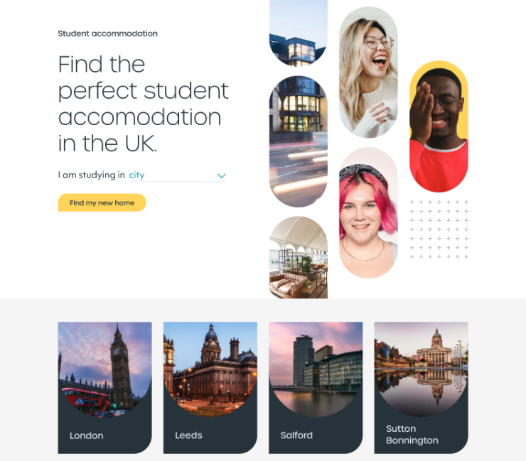
    Example UI design for CLV

    Jackie-Lee Hughes from Deepend – who took the lead on the UI design – and myself rolled out the UI for all pages.

    Due to the nature of the project, this was quite extensive, with home pages for 3 global regions and hierarchy pages for cities, universities, villages and rooms throughout.

  • ‘Love Travel’ brand & guidebooks

    Love Travel guidebooks are a collaboration that has now lasted over a decade. These travel guides to Indian cities are based around sustainable and ethical production, celebrating and continuing the rich artistic traditions of the subcontinent while supporting the livelihoods of artisans and craftspeople.

    The book design for each Love Travel Guide is based on the very first travel books, dating back to the 19th century. Each guide is available with a paper cover or as a luxury edition khadi cotton cover, wrapped in a khadi cotton or silk bag.

    Author Fiona Caulfield takes her readers beyond the obvious tourist attractions. The entries are personally sourced from in-the-know locals including chefs and chaiwallahs, artists and architects, photographers and princesses. The ‘Conscious travel’ symbol highlights the many businesses supported by the guides that give back to their communities.

    Completely hand-made in India, Love Travel Guides celebrate authentic Indian luxury and pay homage to India’s rich craft legacy. Love Travel Guides are printed on paper hand-made in Jaipur and the book covers are made from khadi cotton hand woven in Andhra Pradesh. Love Travel promotes sustainability and conscious, ethical travelling. Love Travel also runs a foundation supporting charitable organisations around India.

    The Love Travel Guides website has more details and information
    lovetravelguides.com

  • Greens NSW state election 15

    From September 2014 to the end of March 2015, I was part of the largest campaign team The Greens have ever put together. I was responsible for the style guide for all campaign materials, as well as for producing and/or overseeing the production of all kinds of printed materials, working with the media buyers on advertising, and with the media team on social media and policy releases. I was responsible for liaising with all local campaign teams for Greens candidates across 93 electorates around NSW, as well as for liaising with suppliers.

    I was senior designer to two staff and a dozen volunteers, as well as a small team of four on logistics and technical support, and sometimes giving direction to the organising and volunteer coordinating teams. I was also part of the team presenting to the Greens campaign committee, and held some presentations on my own as well.

    Here are some examples of print materials and street advertising.

    Greens NSW election campaign 2015, printe mtaerials, design by Eli Brassé

    Greens NSW election campaign 2015, street advertising, design by Eli Brassé

    Some of the billboards for the state election 2015, guru orange for NSW Greens.

    And here are some images of web and social media items.

    Greens NSW election campaign 2015, social media images, design by Eli Brassé
    Website materials for the state election 2015, guru orange for NSW Greens.

    nsw.greens.org.au   The Greens NSW on Twitter   The Greens on Facebook