Blog

  • Medical CX app

    Medical CX app

    Project Overview

    The challenge in building a customer experience app out of lots of disparate content pieces

    To secure immediate stakeholder buy-in and hit urgent commercial milestones, I rapidly designed and built high-fidelity, content-accurate interactive prototypes for an initial footprint of four countries.

    This fast-tracked delivery empowered the client to successfully showcase the innovative product development live at major medical trade fairs across Asia. The customer service teams got very excited by the project!
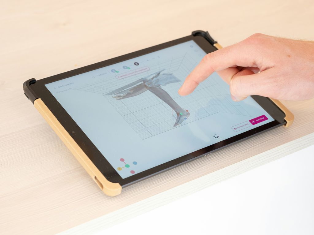
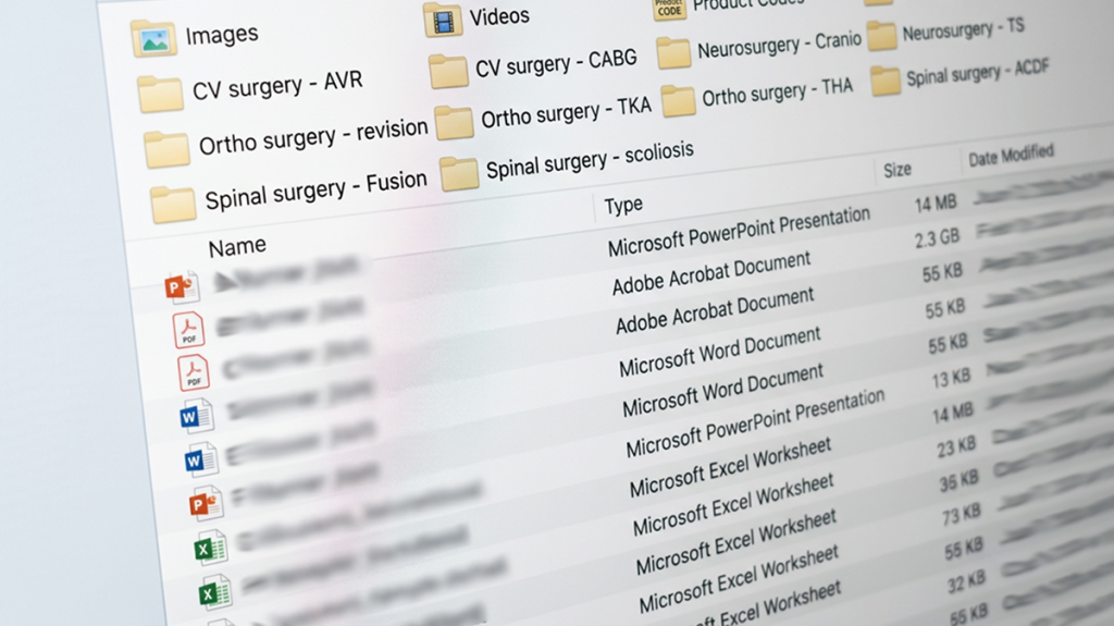
    prototype of a medical app

    Note, this image shows a generic prototype. The app is for use by internal teams only and cannot be shown here.
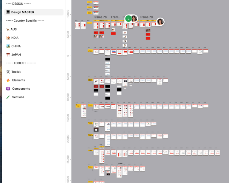
    Complex prototypes in Figma

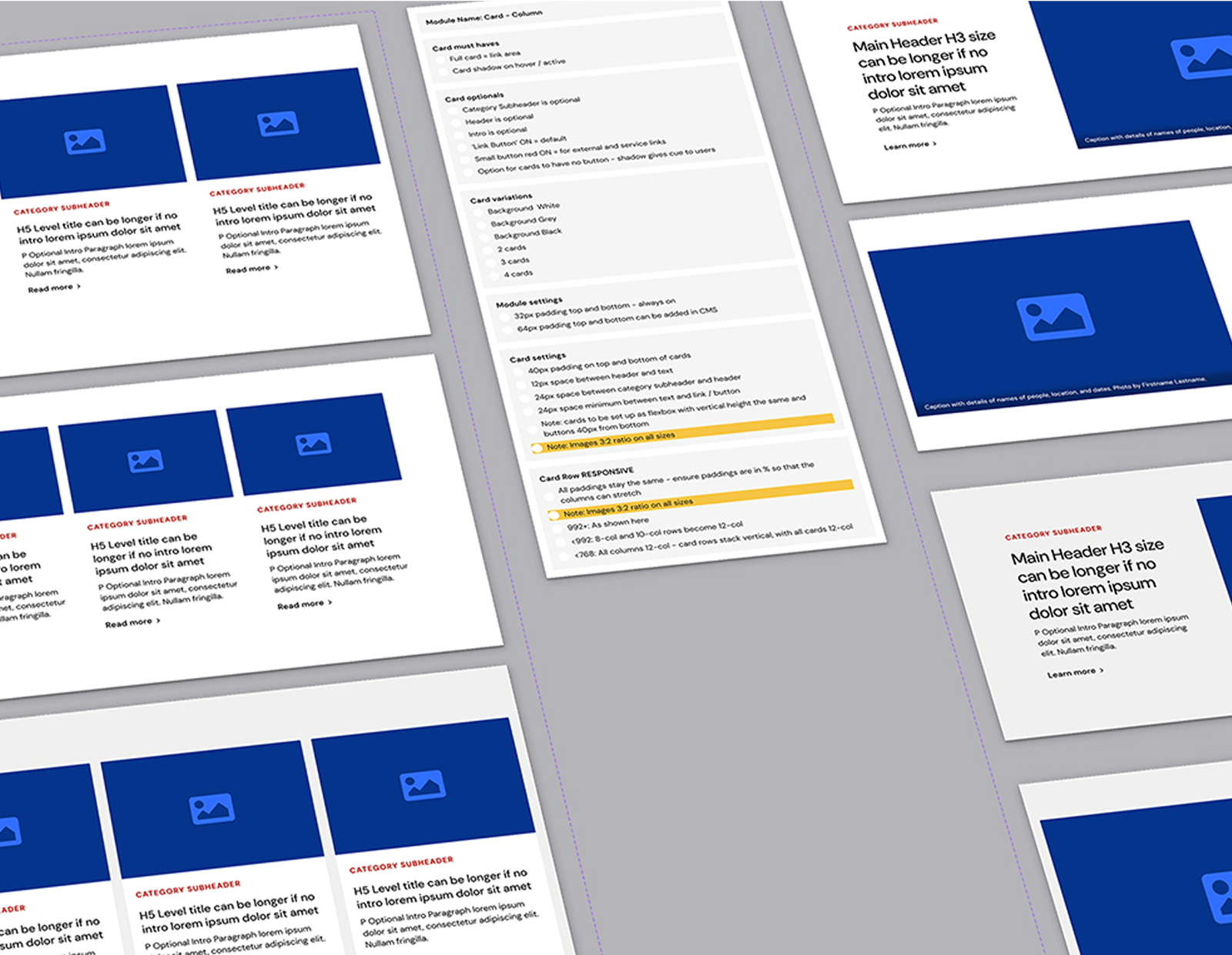
    Transitioning from prototype to a scalable regional asset, I transformed a disjointed and outdated collection of static documentation into a modular, reusable system of responsive UI components optimised specifically for the iPad.

    I then extended the prototype into final UI design for all app screens in the original 4 countries to ensure perfect handover to the developer team.

    Collaborating deeply with the technical team at Tedix and the content/art direction teams, we aligned the UX components directly with fields within a Strapi Headless CMS.

    This integration allowed the content pipeline to leverage AI translation engines, meaning the responsive design layouts could dynamically absorb varying text lengths across multiple Asian languages without breaking the interface.
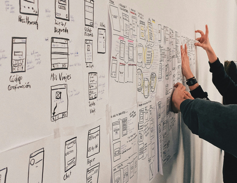
    collaborating on a medical customer experience app

    “Amazing, everything that we need all in one. Finally!”

    – Feedback from a customer service expert during product demo in Australia

  • Night Coach

    Night Coach

    Project Overview

    Night Coach is a vital public health and mobile harm-reduction service designed to deliver accurate, real-time data to the community.

    Managed by health professionals, the application empowers users to make highly informed decisions by providing critical alerts on dangerous substances in circulation, data-driven insights into illicit market contents, and seamless mapping to localised pill-testing and drug-checking services. Operating on a strict zero-data-collection policy, Night Coach delivers confidential, life-saving information exactly when and where it is needed most.

    01

    Zero-Data Public Trust

    An anonymous, zero-data-collection infrastructure that guarantees total privacy for vulnerable user groups.

    02

    Elevated Design Maturity

    A highly polished, clinical-grade user interface designed specifically for high-stress mobile environments.

    03

    Scientific Precision

    Complex laboratory and substance data successfully translated into intuitive, actionable real-time notifications.

    04

    App Store Compliance

    Navigated famously strict public safety guidelines to secure official Apple approval and platform release.

    05

    Vetted Engineering Squad

    An expertly identified and aligned development team that built a highly stable, secure code environment.

    06

    Upskilled Internal Talent

    Deep design mentorship that educated the client’s internal UI resource on complex UX states and design patterns.

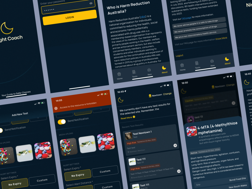
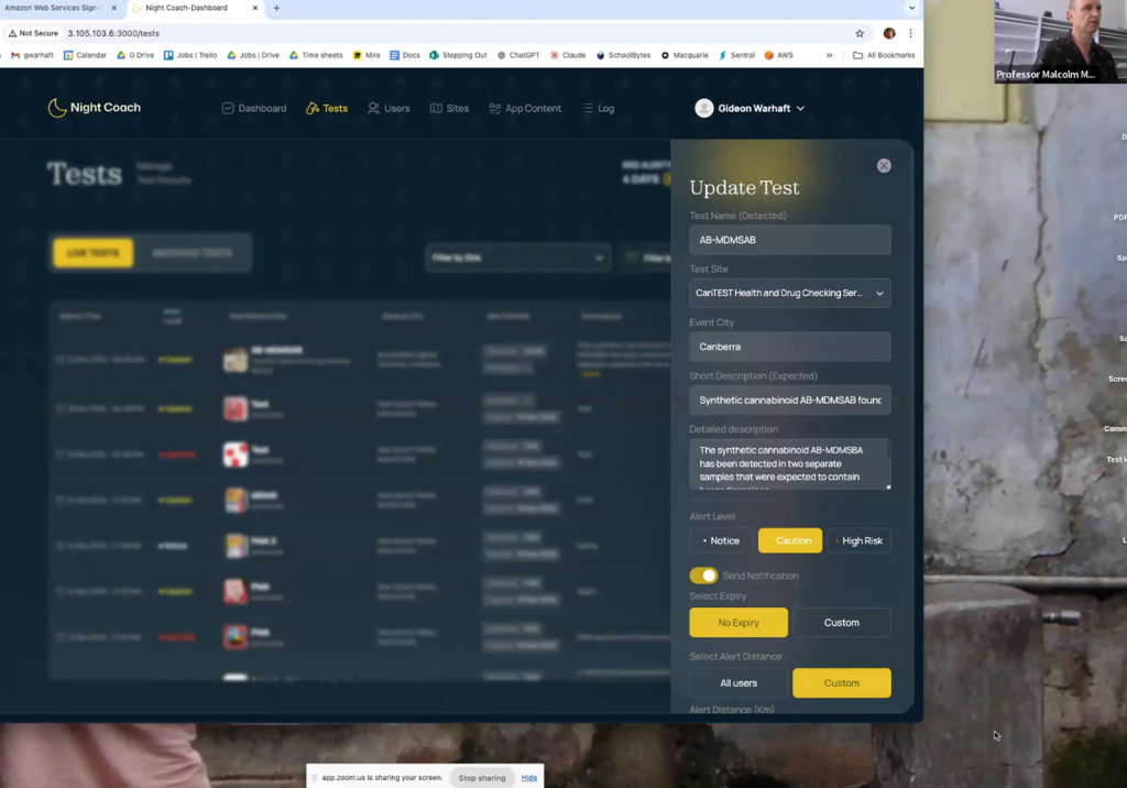
    Nightcoach app product design

    We defined the strategic path to transform complex scientific data into an approachable, high-utility application, mapping out how real-time, high-risk notifications could be delivered without compromising the strict anonymity and data privacy required for vulnerable user groups.

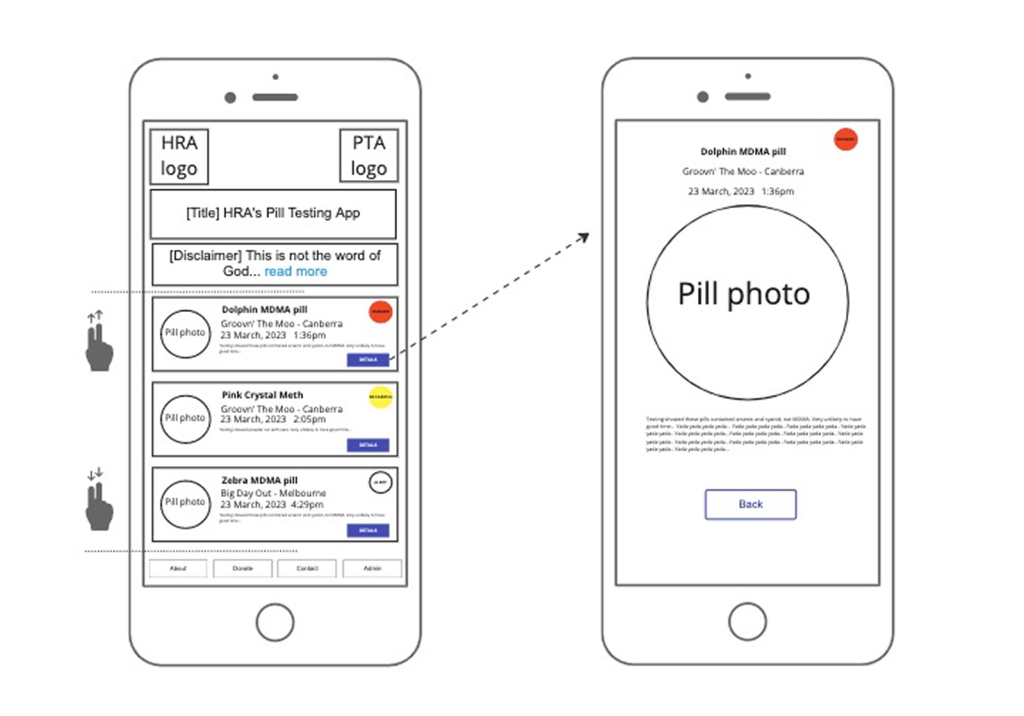
    Early lo-fi wires for Night Coach app design
    Our developer for the Night Coach app

    Recognising the specialised demands of the project, our founder vetted, identified, and led the technical engineering team.

    By aligning with the product architecture from day one, we ensured a highly stable code environment capable of supporting instantaneous, location-aware push alerts.

    Acting effectively as Head of Design, our founder provided deep creative direction and meticulous feedback loops to the UI designer.

    Rather than just handing off wireframes, we treated the project as an educational opportunity, coaching the designer through complex, high-stress UX states (such as emergency notification styling and clear data-visualisation) and providing art direction and creative oversight to substantially elevate the product’s aesthetic maturity and final polish.

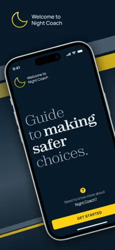
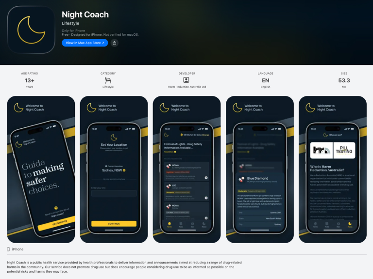
    App Store image for Night Coach app
    Training admin staff on use of the app

    A product like Night Coach relies entirely on trust and precision.

    We successfully harmonised scientific accuracy with user-centered simplicity, ensuring intricate lab results were converted into intuitive, actionable UI components. Then our founder provided training sessions and documentation for everyone involved.

    Securing a presence on the App Store for a platform dealing with controlled substances is an immense regulatory hurdle. Apple’s review guidelines are famously strict regarding public safety apps.

    Our founder directly managed the relationship and exhaustive appeals process with Apple’s review team. Through highly strategic technical documentation and rigorous defense of the app’s framework, we successfully demonstrated its compliance as a strict public health service, pushing the app past standard blocks and securing its official App Store release.

    App Store full image

    “This is fantastic work! Including not only end-to-end product design, but also putting together a team and guiding them in best practice user experience and helping them see the ‘why’ really adds so much value.”

    – Gino Vumbaca, Pill Testing Australia
  • Quantum Computing education platform

    An exciting new project hat is just wrapping up. More to report soon!

  • Westfund + app

    Westfund + app

    Gaps in health care across regional Australia are an ongoing concern for communities. Deepend was engaged to research into people’s experiences and then to develop a new digital product that aims to help the health fund’s members access and navigate health care.

    Following our insights gathered in the research phase, we helped the client prioritise their ideas and develop a product direction. From a variety of proposals they chose the idea of a preventative health app. Once the product direction was established, we designed the app from first principles to launch, scheduled for May 1, 2025.

    Leading product design, I was instrumental in planning and delivering research, journey mapping, identifying possible future products.
    Once the product to be designed was decided, I was responsible for creating personalised product logic, co-creating features and delivering complete experience design.

    Phase 1: Research & Innovation

    Members interviewed

    Exploring health journey experiences

    Stakeholder workshops

    Close collaboration from context to ideation

    80+

    From the immediately actionable to never heard

    Product directions

    Evaluated and prioritised using R. I. C. E. framework

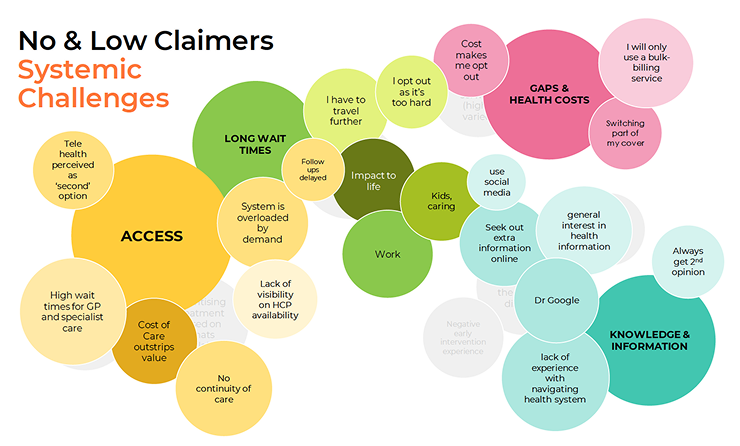
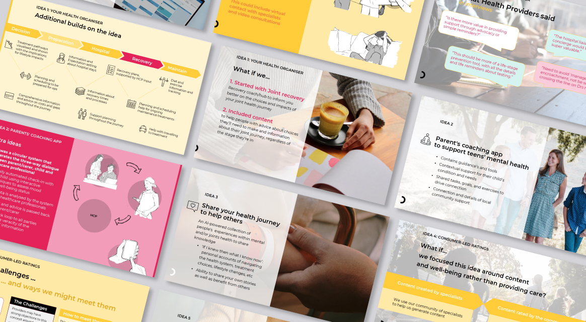
    Example of research delivered for Westfund + app

    Over 2 months of research, from category desktop research over stakeholder context to in-depth interviews with identified member cohorts, we investigated the health care experience of regional Australians.

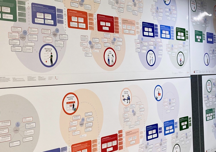
    Journey mapping

    We mapped their journeys, with special consideration to showing how key opportunities arise from experience. Finalised maps are now proudly displayed at client offices.

    The final journey map file as printed and displayed at the Westfund head office
    Product directions created for the Westfund app

    From insights to features

    From the many opportunities we identified, we generated 6 product ideas that were refined in co-creation with the client.

    Phase 2: Product Design

    We moved from developing a digital product strategy and early ideation to MVP product design. The idea the client decided to develop is centered around encouraging health fund members to stay on track with important health checks and taking up wellbeing programs that are part of their plan. In future phases the product will also allow bookings for health checks and earning rewards.

    Co-creation

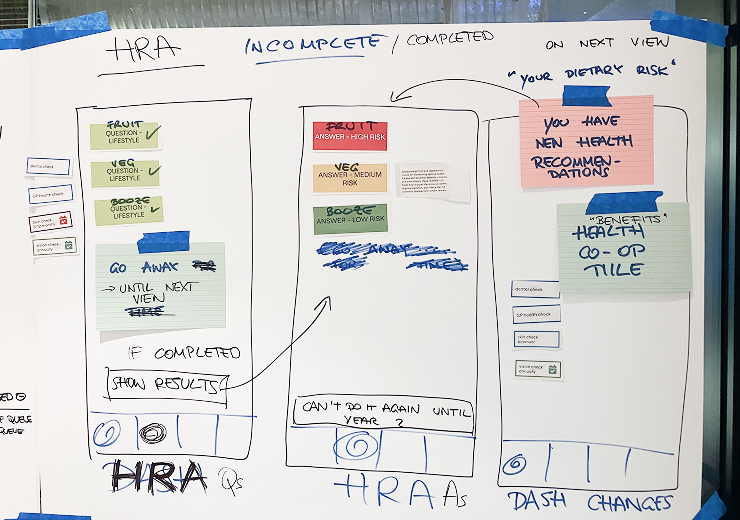
    We ran a series of flexible co-creation workshops with the client team to guide them through decision-making for app features and business rules.

    Cocreating the content for the Westfund app
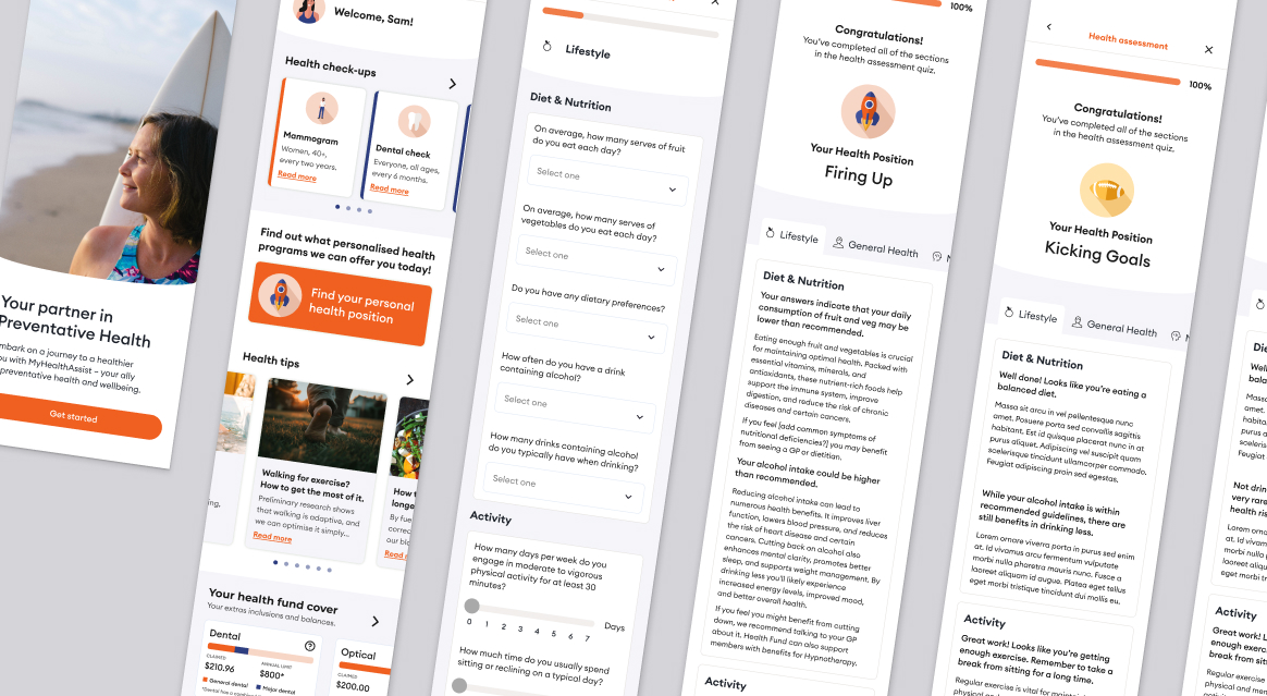
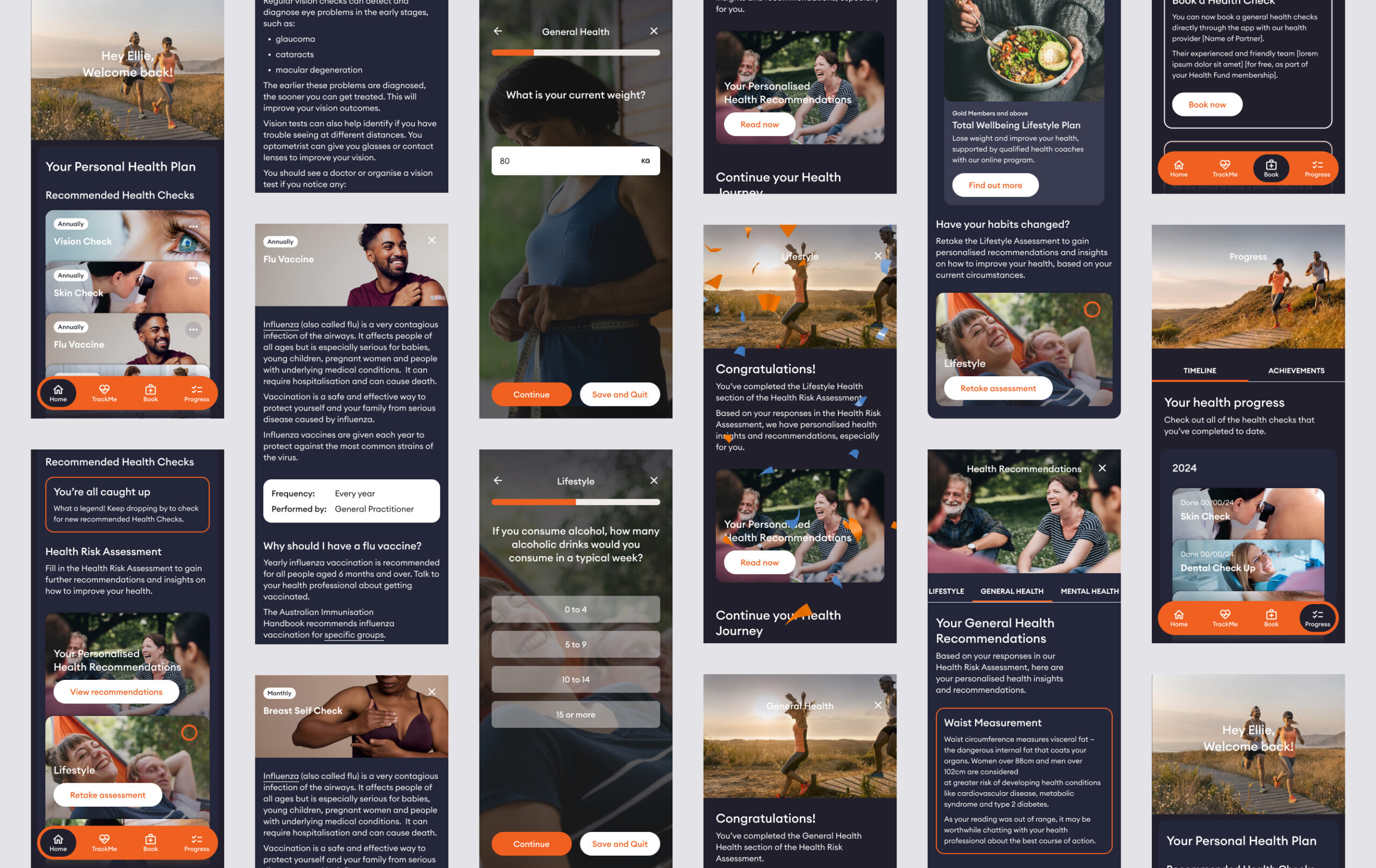
    UX design example for Westfund + app

    Experience design

    I then wireframed all parts of the product so that the client team could quickly write copy and decide on content hierarchy.

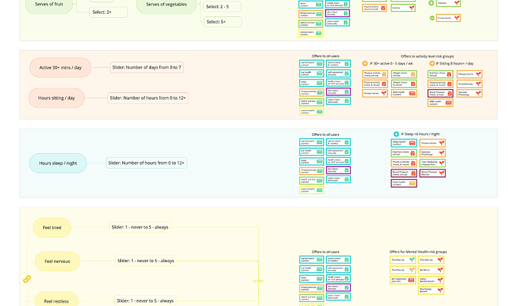
    Personalisation rules

    Designing a system of rules for what content will be offered to which user set, based on their answers in an online health questionnaire.

    Example of Westfund + questionnaire content rules

    Sneak preview of the final product design

    Example of original UI design for Westfund + app
  • Teacher’s Health Fund

    Teacher’s Health Fund

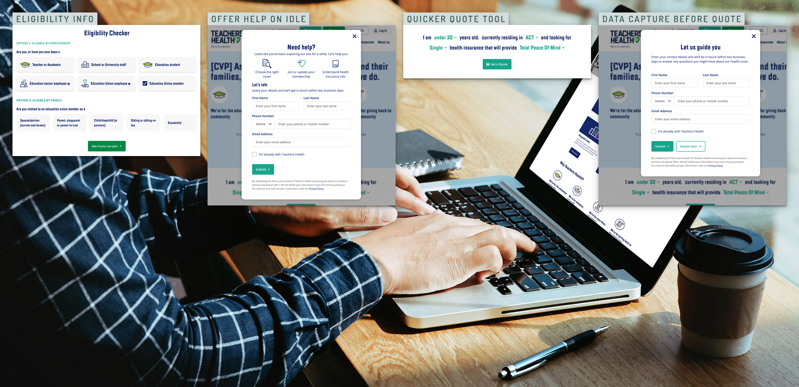
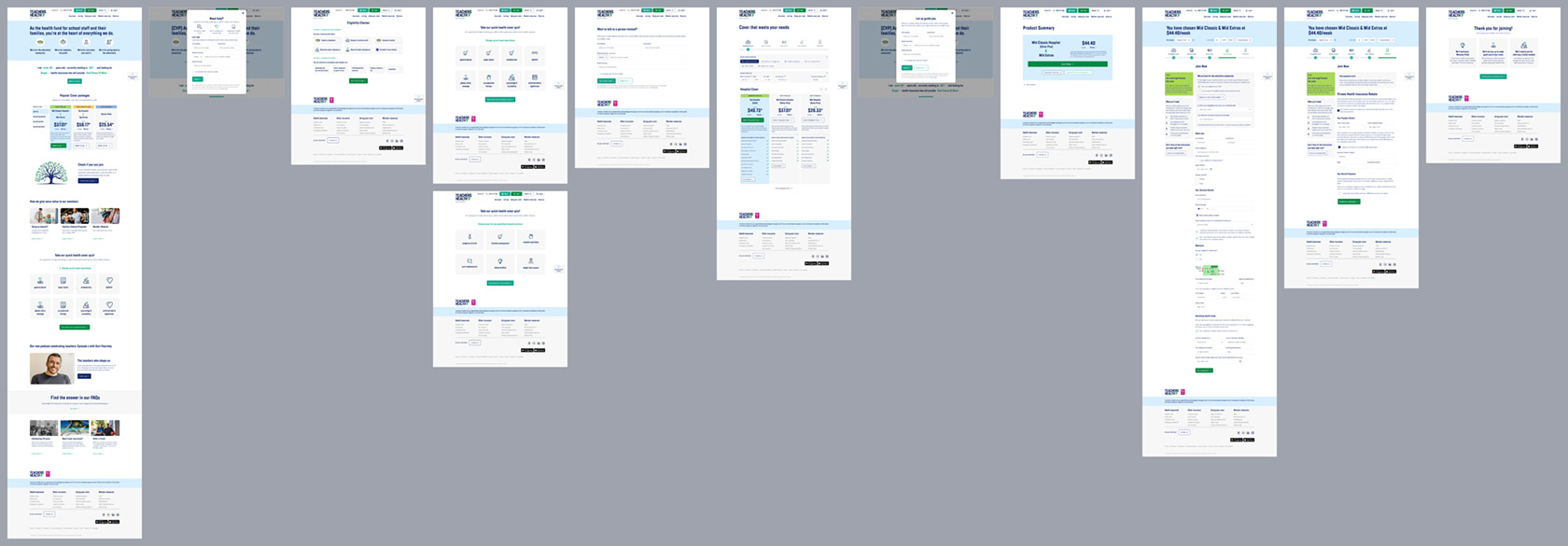
    This member-based health fund, eligible to parts of the community only, is operating in a rapidly evolving sector with heightened competition and increased expectations of digital experiences. A lack of investment in experience has become a risk to competitiveness to the fund, so Deepend was engaged to strategically bring the website to digital parity using a data-driven and user-centric approach. We focused on the prospect journey as proof of concept, using a two-phased approach that is currently being rolled out.

    We collaborated with the fund’s team to create an optimised journey that aligns with industry best practices and user expectations, introducting rapid experiments and improvement frameworks to ensure measurable acquisition uplift.

    Phase 1: demonstrating uplift

    5% uplift

    ‘Quote’ conversions

    Quick and agile experimentation resulted in refined UX/UI that maximises conversion in short term, prior to development effort.

    10% uplift

    ‘Join’ completions

    Improving clarity, setting expectations and refining experience created uplift in acquisition while still using the existing form.

    >> uplift

    Establishing a roadmap that drives long-term agility and iterative acquisition improvement sets the groundwork for digital parity.

    Phase 2: getting to digital parity

    01

    Filling gaps in experience

    Created pathways towards bringing experience up to best practice, ‘chunking up’ journey parts to enable staged delivery.

    02

    Leveraging off stronger data

    Created pathways for continuous improvement via GA4 tracking and agile testing processes for future interventions.

    03

    Driving towards an ideal future

    Leveraging user insights to ensure development effort is put towards the right improvement and planning for creating the ideal future.

    Strategic, data-driven co-creation

    A six-week discovery sprint using a collaborative model with a cross-organisational team assessed the effectiveness of the fund’s existing digital prospect journey.

    Our approach combined qualitative and quantitative insights, competitor benchmarking, and real-time experimentation to inform a backlog of high-impact initiatives.

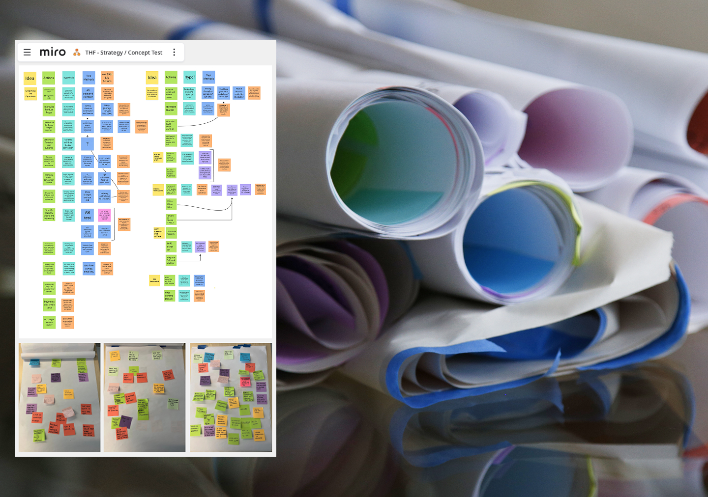
    example of stakeholder alignment and strategy work

    Stakeholder alignment workshops

    A six-week discovery sprint using a collaborative model with a cross-organisational team assessed the effectiveness of the fund’s existing digital prospect journey. Our approach combined qualitative and quantitative insights, competitor benchmarking, and real-time experimentation to inform a backlog of high-impact initiatives.

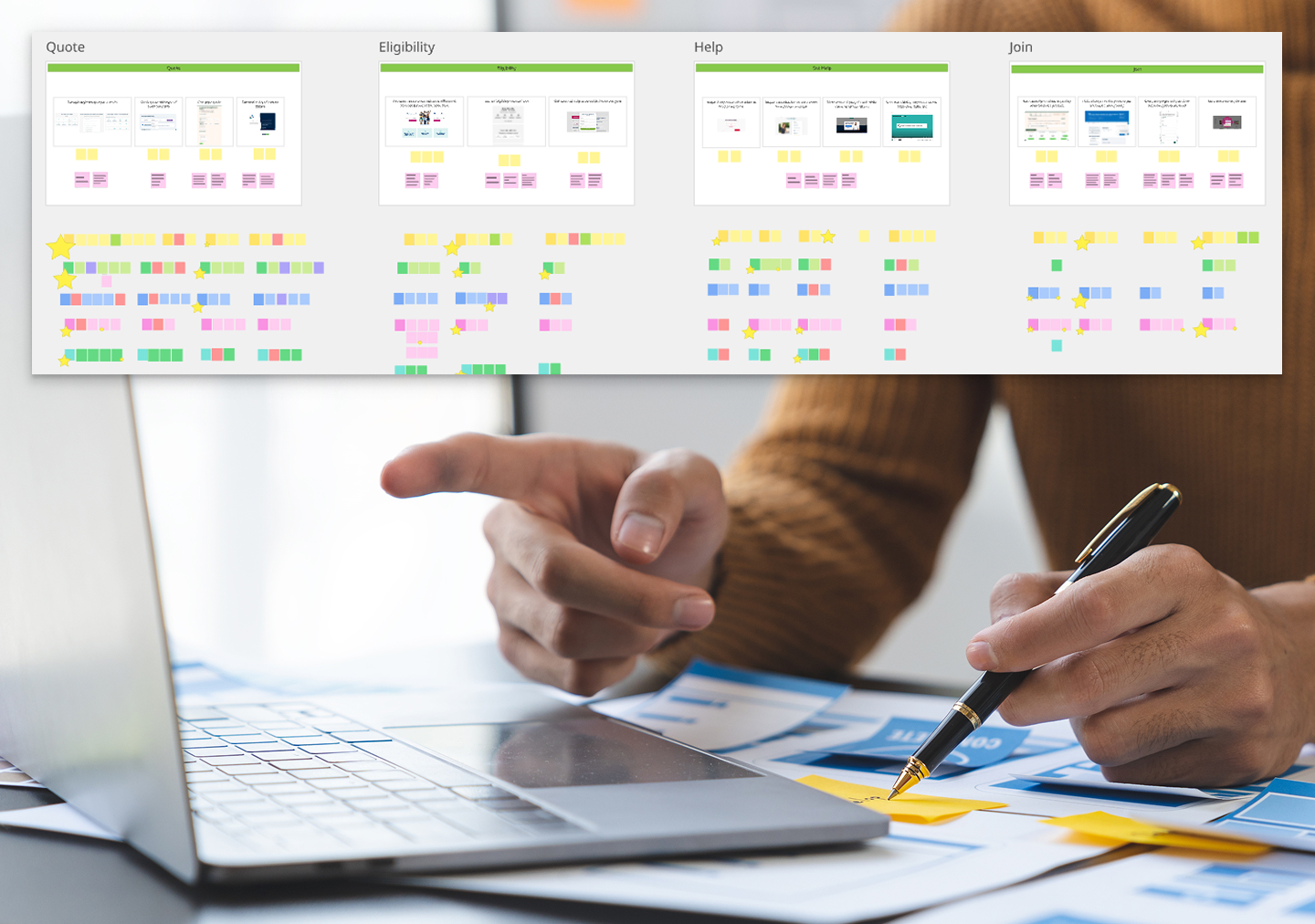
    User research and testing

    Identifying key experience gaps and validating potential interventions.

    Example of user research work
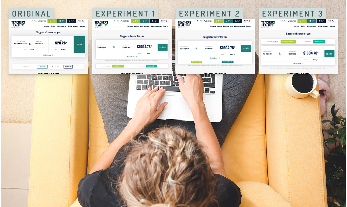
    Example of quick UX uplift experiments

    Hypothesis-driven experimentation

    Iteratively improving conversation paths and optimising core digital touchpoints, delivered in agile sprints.

    Filling experience gaps

    Leveraging off insights and hypotheses created in the strategic phase, we moved towards creating an ideal future, designing small-scope itemised parts of the future journey and refining them with experimentation.

    Quick experiments with parts of the ideal future journey for phasing out project scope

    Driving towards an ideal future

    During the first phase, we had increasingly pointed experiments towards an ideal future. In phase 2, I designed a prototype to take the ideal future we all believed in to user testing. Because the continued experimentation established some guardrails already, we were able to scope a lean test with parts of the overall acquisition journey already proven and under development.

  • Sound Surge

    Sound Surge

    Sound Storm was originally developed by Deepend for National Acoustics Laboratory before I joined the company. I have been leading the experience design on various updates and continuous improvement projects.

    This large update, called Sound Surge, is currently in development and takes Sound Storm to a new market in the US.

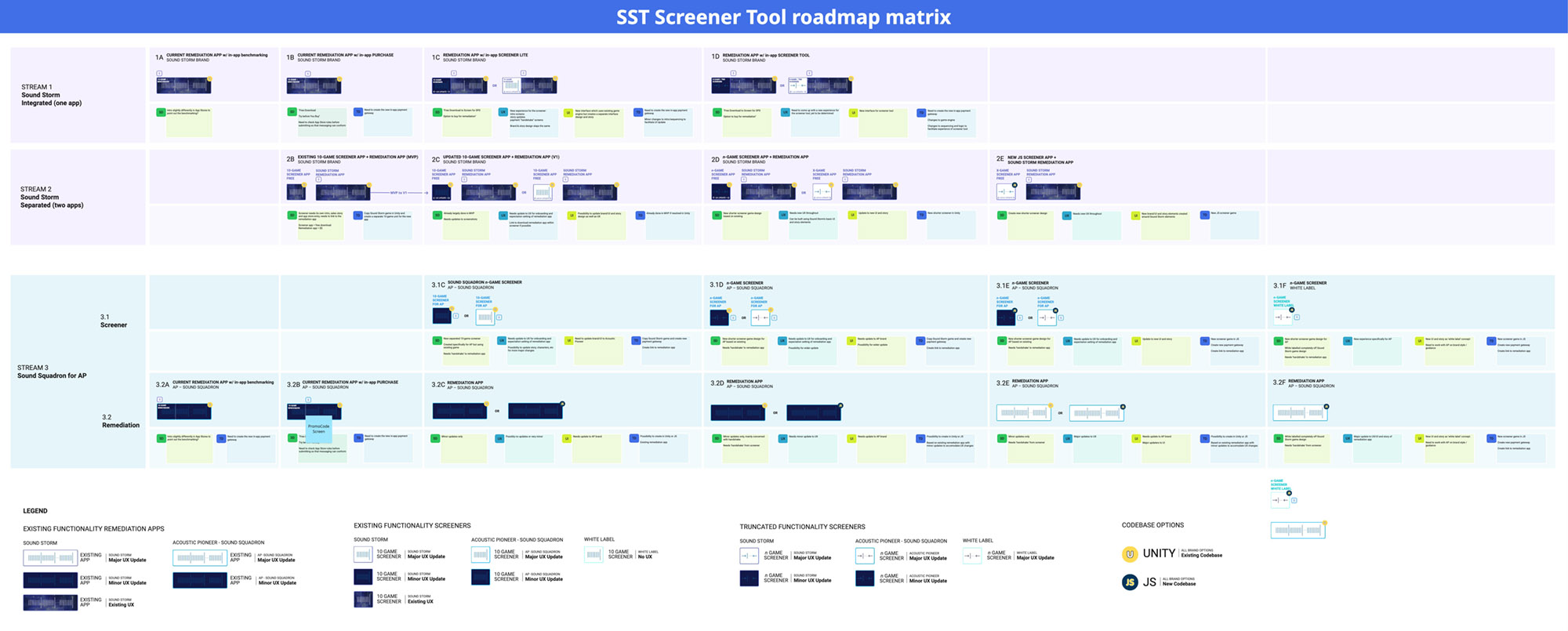
    Roadmap with all product options visualised

    The complexity of options available to us in creating a new digital product out of the legacy Sound Storm app required us to communicate possibilities with all stakeholders. So, Deepend founder Matt G and myself collaborated in creating an overview in an interactive visual map on Miro.

    A major update of a legacy product, by its nature, often results in going to the vault and finding documentation – what software is used changes over time.

    For this design, the original was delivered in a layered photoshop file, so my own legacy skills came in handy (I first learned Photoshop Version 1 as a teen helping out in my dad’s creative agency)

    Because this project started with a legacy design, our major design updated is a mix of fact-finding, wireframes for new functionality and updated UI elements to meet modern criteria for resolution and accessibility and to satisfy user needs we learned about over time.

    Example screen for Sound Surge product design

    Drawing on the critical user knowledge from team members Kath O’Malley (product owner) and Isaac Nault (product manager), we found the best and most viable UI update together.

    As experience lead, I made sure to incorporate what the team learned from real live users over the years, so we could create an update that is even easier to use and understand than the original.

  • Australian Red Cross

    Australian Red Cross

    Project Overview

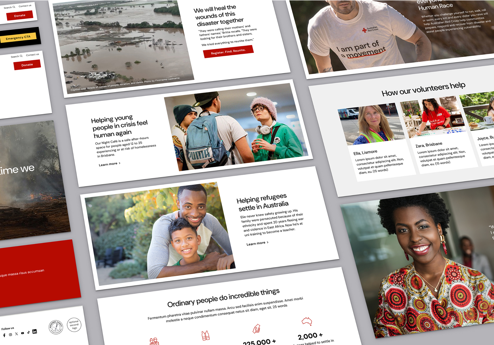
    The Red Cross refreshed its brand and needed a digital design that brings it to life. The resulting digital brand design, GEL, and website update were delivered over 18 months. 

    This comprehensive digital product design project was executed end-to-end, with the development handled on the client side. The project remains in progress, with a projected launch in August. 

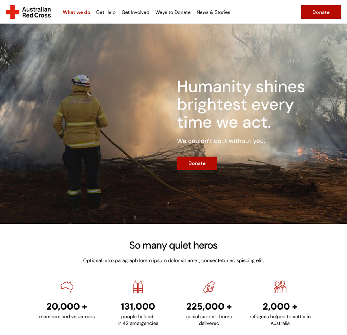
    Australian Red Cross website update - original home page design
    1. 2023 ARC Brand Traits that answer to photojournalism’s guiding principles
      • Emotional: Empathetic, Authentic, Warm
      • Rational: Confident, Credible, Neutral
      • Reaction: Make it Easy for People to Act, Walk the Talk
    2. Respecting the diverse needs of varied user groups. Addressing the unique needs of refugees in crisis, as well as philanthropists seeking to support the ARC’s mission. 
    3. A consistent and flexible system. Ensuring trust in the brand while accommodating the complexity of the organisation’s operations. 

    Our research has identified two primary user groups, each with distinct needs: 

    1. People seeking help: Often arriving on the site in distress, looking for immediate assistance following disasters or upon arrival in Australia. 
    2. People wishing to give help: Looking for validation and guidance on how best to support those in need. 

    To address these distinct needs, we developed a set of key pages that serve as a guide for content creators, ensuring a seamless and empathetic user experience. 

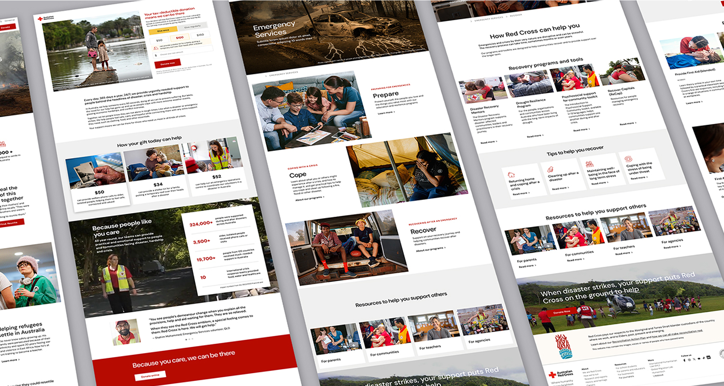
    Australian Red Cross website update page design examples
    Australian Red Cross UI component design examples

    Beyond strategy, our focus was on crafting a modern, vibrant digital brand. This involved: 

    • Integrating animations and dynamic elements such as parallax and horizontal scrolling. 
    • Expanding video content capabilities to enhance engagement and storytelling. 

    This large-scale website update involved: 

    • Creating 36 new and updated UI components and collaborating with an external development team to implement them in Optimizely. 
    • Designing 70+ key pages and user journeys with a research-driven approach, including a new donations journey using expertise created in a distinct research project.
    • Introducing a ‘component spec sheet’ as a design reference to streamline communication between design and development teams. 
    • Working with digital developers LEVO to implement and roll out the new design across all components
    Australian Red Cross design system

    The Design System is available as both a Figma library file and a GEL website, ensuring accessibility for all Australian Red Cross staff. This resource: 

    • Educates teams on design principles and user experience best practices. 
    • Establishes a common language and detailed documentation for every component. 

    Encourages seamless collaboration between teams, improving content creation and consistency. 

  • OzHarvest

    OzHarvest

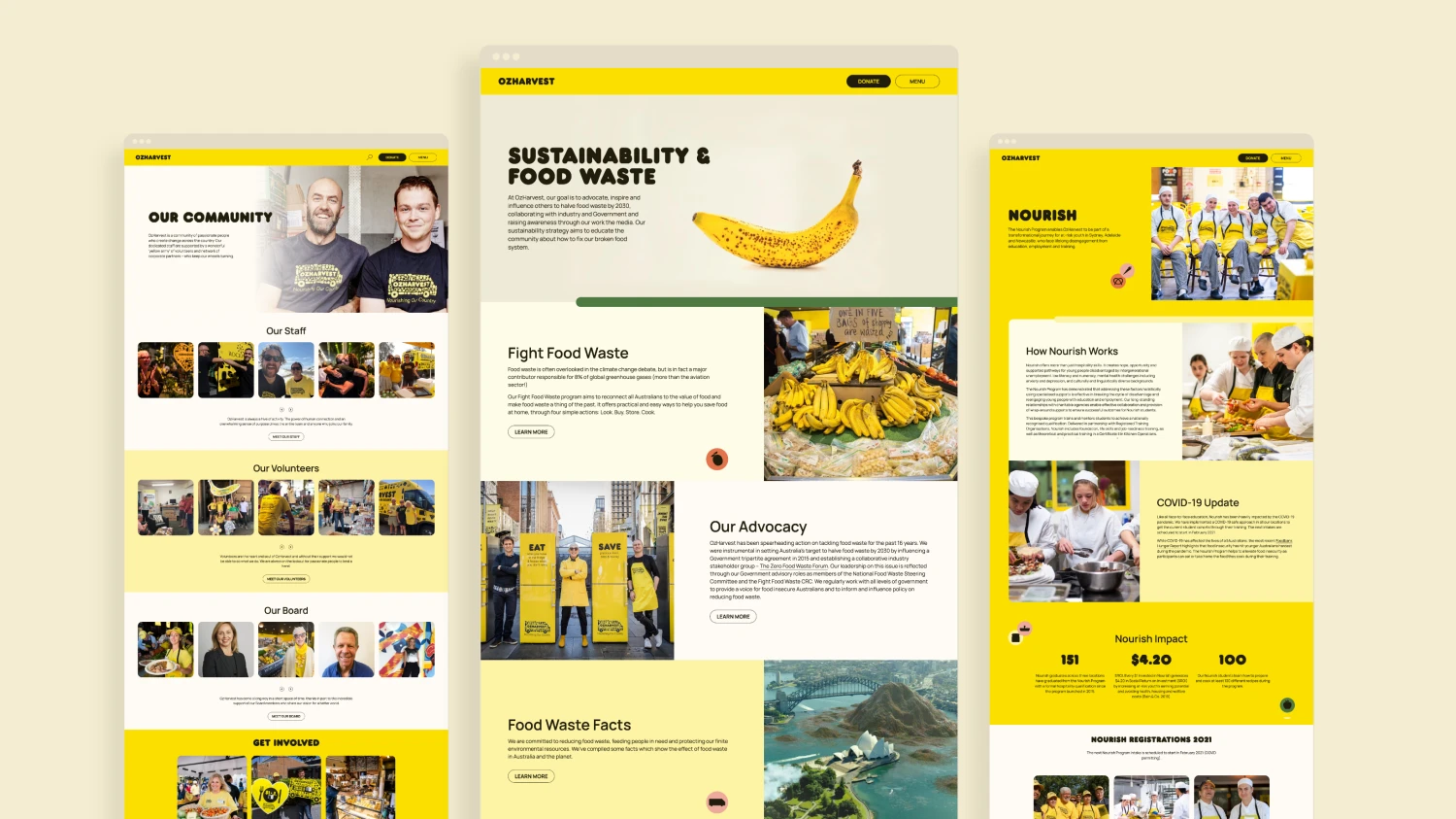
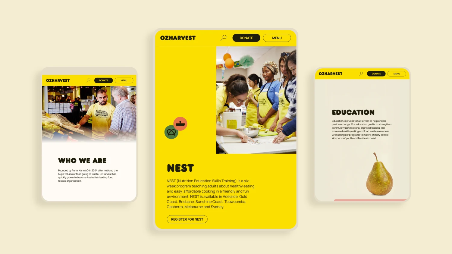
    Ozharvest web pages examples from Paper Moose

    OzHarvest had not updated their website in 15 years, so this major update was a major challenge in many ways.

    Originally engaged as a freelancer for Paper Moose to spend 3 weeks on IA, I ended up seeing the project through to the end of the design stage, about 9 months later. The Mooses have written a lovely case study on the project.

    Our first priority was a new structure and hierarchy for the organisation’s many arms, making sense of what they do.

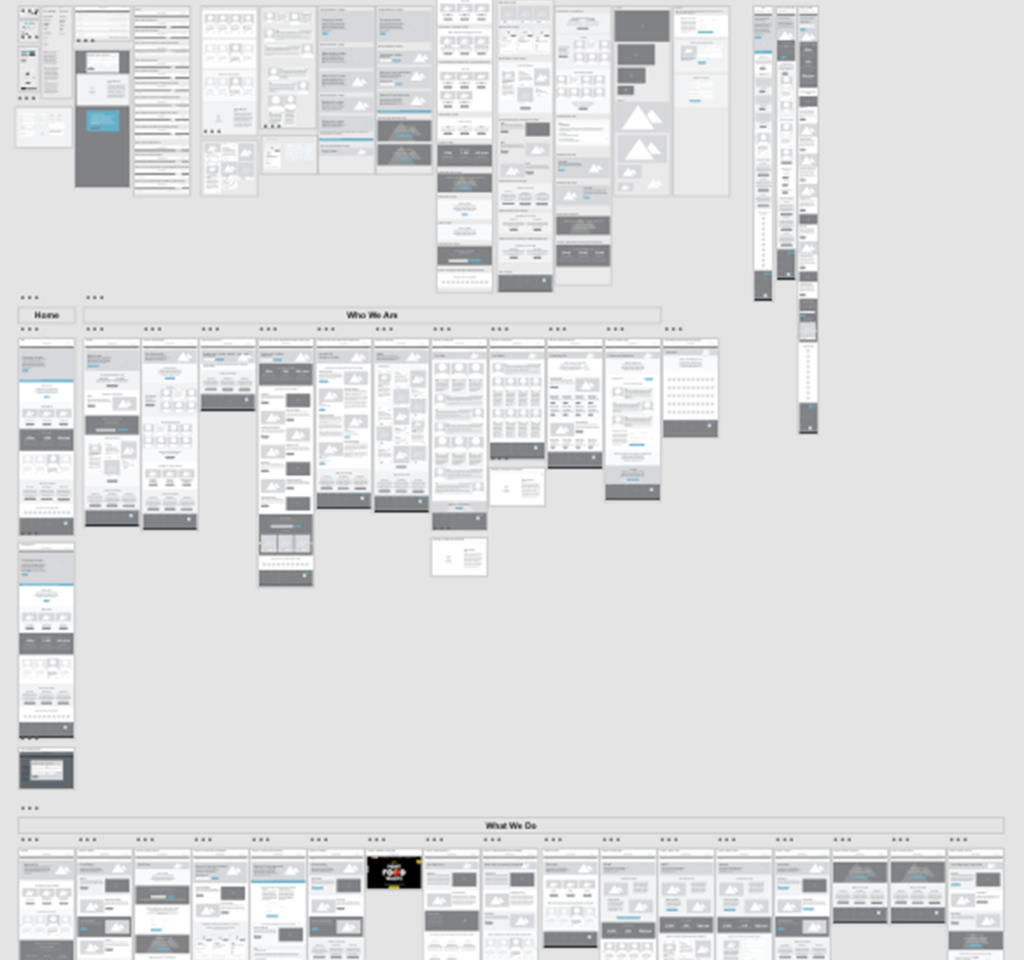
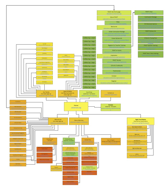
    Conducting several workshops around content, user journeys and personas, I collaborated with client teams to restructure and slim down 7 WordPress websites with 132 pages into 2 sites with 34 pages.

    OzHarvest site map and IA update
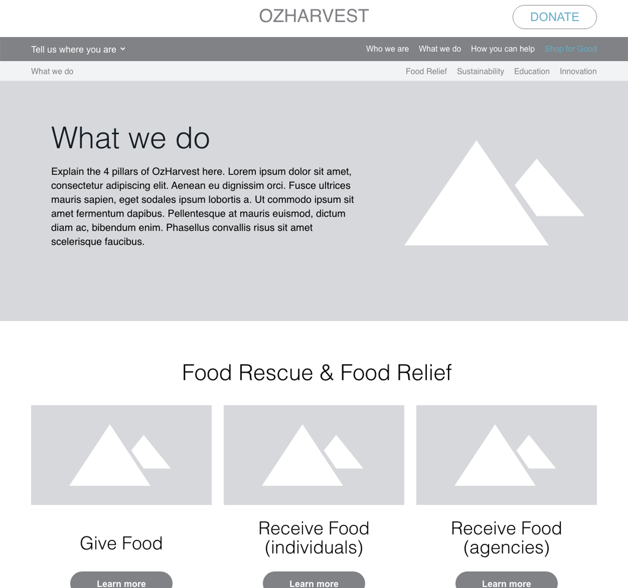
    Ozharvest wireframes - detail
    OzHarvest wireframes excerpt

    Next, we mapped out how OzHarvest can most easily explain what they do in future. I had opportunity to inject my knowledge about experience design for the NGO sector, and to collaborate on the content design with the client’s comms team.

    I provided content design and detailed wireframes for all site pages.

    Paper Moose’s Divya Abe was the UI Design Lead on the project, while I passed on the client context and knowledge I had gained during the UX phase and acted as design consultant, helping find two on-brand design concepts.

    We then collaborated in creating final page designs across all breakpoints.

    Example detail of a UI page design for Ozharvest, for Paper Moose, with Divya Abe, 2021
  • Sound Surge

    A Collaborative Update

    Sound Storm was originally developed by Deepend for National Acoustics Laboratory before I joined the company. I have been leading the experience design on various updates and continuous improvement projects.

    This large update, called Sound Surge, is currently in development and takes Sound Storm to a new market in the US.

    The original award winning project is described well in this case study by Deepend

    Sound Storm story design hero Suno the lion
    Sound Storm digital product map

    Roadmapping Digital Product Options

    The complexity of options available to us in creating a new digital product out of the legacy Sound Storm app required us to communicate possibilities with all stakeholders. So, Deepend founder Matt G and myself collaborated in creating an overview in an interactive visual map on Miro.

    A screenshot from Figma showing a legacy digital product being updated

    Product Design Approach

    Because this project started with a legacy design, our major design updated is a mix of fact-finding, wireframes for new functionality and updated UI elements to meet modern criteria for resolution and accessibility and to satisfy user needs we learned about over time.

    A Fact-Finding Mission

    A major update of a legacy product, by its nature, often results in going to the vault and finding documentation – what software is used changes over time.

    For this design, the original was delivered in a layered photoshop file, so my own legacy skills came in handy (I first learned Photoshop Version 1 as a teen helping out in my dad’s creative agency)

    Incorporating User Knowledge

    Drawing on the critical user knowledge from team members Kath O’Malley (product owner) and Isaac Nault (product manager), we found the best and most viable UI update together.

    As experience lead, I made sure to incorporate what the team learned from real live users over the years, so we could create an update that is even easier to use and understand than the original.

    As the new app is about to go live in schools around the US, I hope it will help even more children understand their teachers in noisy school environments – a cause that has been dear to my heart. Good luck, Suno!

  • ReachOut PeerChat

    Young people’s mental health and wellbeing is a major concern with almost 40% of 16–24 years old experiencing mental health struggles over the course of a year. Around a third of these young people have not sought professional support. There are numerous systemic barriers that result in an urgent, unmet need for early intervention and youth-centred services for around 1 million young Australians.

    PEERCHAT PARTICIPANT FEEDBACK

     A Young man sending a text message from his home

    Working hand in hand with online mental health service ReachOut, Steve Sullivan from How to Impact and myself conducted research into the specific support needs of young people with mental health struggles over a 12-week period. We then developed design guardrails for possible service models, ensuring the creation of a relevant and useful service.

    3 targeted co-design sessions and 2 online service experiments found that what young people needed most was for someone to listen and validate their struggles. One-on-one online chat with a trained peer emerged as their preferred method.

    PeerChat Innovation Research by Eli Brassé and Steven Sullivan

    Over 7 weeks of innovation focused codesign sprints, we uncovered young people’s support needs for a mental health service design that improves emotional wellbeing.

    We codesigned a peer worker service model, involved the peer community in testing and service pilots, and created operational procedures. Steven was the lead on this part of the project.

    PeerChat Service Design by Eli Brassé and Steven Sullivan

    Once the service model was uncovered, I created a blueprint and led the ReachOut team through a codesign process towards an ideal product design. The user experience was, again, tested extensively with young people, and I collaborated with the ReachOut tech team to create final designs that were effective for them to build. Deepend’s Jackie-Lee Hughes contributed to the User Interface design.

    PeerChat Use Cases by Eli Brassé and Steven Sullivan

    From our co-created design vision and guardrails, we developed three distinct use cases that our service model answers.

    Through prototype-based codesign techniques, we progressively evolved a design with a booking system, onboarding and chat that answer to specific support needs.

    PeerChat Product Design by Eli Brassé and Steven Sullivan
    PeerChat Interface Design by Eli Brassé and Jackie-Lee Hughes

    Our text chat design includes innovative health focused solutions such as the ability to hide previous messages from view to avoid re-triggering and the ‘I’m thinking’ button that gives support seekers time while ensuring supporters are informed that everything is okay.

    PeerChat Interface Design by Eli Brassé and Jackie-Lee Hughes

    To ensure that users’ emotional wellbeing is enhanced, we augmented the main chat functions with a variety of innovative designed interventions, such as this calming onboarding interaction that reduces anxiety on starting the support chat.

    Results

    PeerChat helps hundreds of young Australians each year to overcome systemic mental health support barriers when they need it most.

    In the first six months and over 1,000 chats, young people reported a 73% improvement in wellbeing and gave the service an 8.2 out of 10 star rating.

    PeerChat can reduce distress, increase mental health knowledge, and positively influence the way young people feel about themselves and others. It enhances the wellbeing of young people through connection, understanding, and hope. Its digital, anonymous, and one-on-one nature improves accessibility for our most vulnerable communities. Importantly, it’s an exemplar for the value of people with lived experience to co-produce and deliver safe services that are highly personal while being relevant and inclusive for the diverse nature of humanity.

    Good Design Award Gold Winner 2023

    Good Design Awards

    Service Design

    Gold Winner

    Good Design Award Winner 2023

    Good Design Awards

    Social Impact

    Winner

    Good Design Award Winner 2023

    Good Design Awards

    Digital Design – Apps & Software

    Winner

    Designers Australia Awards 2023
    Designers Australia Awards
    Interact

    Category Winner